
GLM in R: Generalized Linear Model & Logistic Regression
 Editorial Team
⚡ Smart Summary
Generalized Linear Model (GLM) in R extends ordinary regression to outcomes that are binary, count based, or non-normal. This walkthrough builds a logistic GLM on the adult income dataset and evaluates it with accuracy, precision, recall, and ROC.
What is a Generalized Linear Model (GLM) in R?
A Generalized Linear Model (GLM) extends ordinary linear regression so the response variable may follow a distribution other than the normal one. In R, you fit one with the built-in glm() function from the stats package.
Every GLM is defined by three components:
- Random component: the probability distribution of the response variable, taken from the exponential family (binomial, Poisson, Gamma, Gaussian, and others).
- Systematic component: the linear predictor, that is the weighted combination of your explanatory variables.
- Link function: the function that connects the mean of the response to the linear predictor, for example the logit link for binary data or the log link for counts.
That structure is what makes the model “generalized”. Instead of forcing a normally distributed outcome, you declare the correct distribution through the family argument and R estimates the coefficients by maximum likelihood. Logistic regression is simply a GLM with a binomial family and a logit link, so it is the natural starting point.
What is Logistic Regression in R?
Logistic regression is used to predict a class, i.e., a probability. Logistic regression can predict a binary outcome accurately.
Imagine you want to predict whether a loan is denied/accepted based on many attributes. The logistic regression is of the form 0/1. y = 0 if a loan is rejected, y = 1 if accepted.
A logistic regression model differs from linear regression model in two ways.
- First of all, the logistic regression accepts only dichotomous (binary) input as a dependent variable (i.e., a vector of 0 and 1).
- Secondly, the outcome is mapped through a probabilistic link function called the sigmoid (logistic) function due to its S-shape:

The output of the function is always between 0 and 1. Check Image below
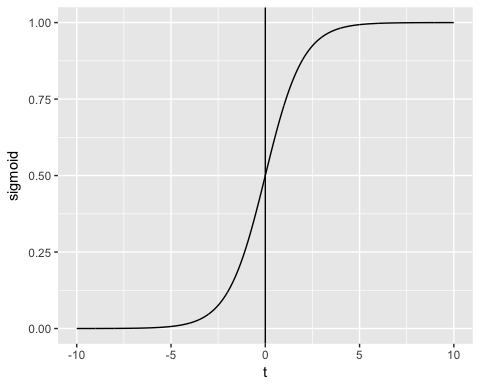
The sigmoid function returns values from 0 to 1. For the classification task, we need a discrete output of 0 or 1.
To convert a continuous flow into discrete value, we can set a decision bound at 0.5. All values above this threshold are classified as 1

Now that the link function is clear, compare the generalized model with the ordinary linear model you already know.
GLM vs Linear Regression: Key Differences in R
Before you write any code, it helps to know exactly when the standard linear regression function lm() is no longer appropriate and glm() should take its place.
| Criteria | Linear Regression (lm) | Generalized Linear Model (glm) |
|---|---|---|
| Response variable | Continuous and unbounded | Binary, count, proportion, or positive continuous |
| Error distribution | Normal only | Any exponential family member |
| Link function | Identity (implicit) | Explicit: logit, log, inverse, probit |
| Estimation method | Ordinary least squares | Maximum likelihood (IRLS) |
| Variance assumption | Constant across observations | Allowed to depend on the mean |
| Goodness-of-fit measure | R-squared | AIC and residual deviance |
| R function | lm(formula, data) | glm(formula, data, family) |
In short, choose lm() when the outcome is a normally distributed measurement and glm() whenever the outcome is a yes/no decision, a task you could otherwise hand to a decision tree classifier, an event count, or a strictly positive quantity whose spread grows with its mean.
How to Create a Generalized Linear Model (GLM) in R
With the theory settled, the rest of this tutorial applies a binomial GLM end to end on a real dataset.
Let’s use the adult data set to illustrate Logistic regression. The “adult” is a great dataset for the classification task. The objective is to predict whether the annual income of an individual in US dollars will exceed 50,000. The dataset contains 48,842 observations and ten variables:
- age: age of the individual. Numeric
- education: Educational level of the individual. Factor.
- marital.status: Marital status of the individual. Factor i.e. Never-married, Married-civ-spouse, …
- gender: Gender of the individual. Factor, i.e. Male or Female
- income: Target variable. Income above or below 50K. Factor i.e. >50K, <=50K
amongst others
library(dplyr)
data_adult <-read.csv("https://raw.githubusercontent.com/guru99-edu/R-Programming/master/adult.csv")
glimpse(data_adult)
Output:
Observations: 48,842
Variables: 10
$ x               <int> 1, 2, 3, 4, 5, 6, 7, 8, 9, 10, 11, 12, 13, 14, 15,...
$ age             <int> 25, 38, 28, 44, 18, 34, 29, 63, 24, 55, 65, 36, 26...
$ workclass       <fctr> Private, Private, Local-gov, Private, ?, Private,...
$ education       <fctr> 11th, HS-grad, Assoc-acdm, Some-college, Some-col...
$ educational.num <int> 7, 9, 12, 10, 10, 6, 9, 15, 10, 4, 9, 13, 9, 9, 9,...
$ marital.status  <fctr> Never-married, Married-civ-spouse, Married-civ-sp...
$ race            <fctr> Black, White, White, Black, White, White, Black, ...
$ gender          <fctr> Male, Male, Male, Male, Female, Male, Male, Male,...
$ hours.per.week  <int> 40, 50, 40, 40, 30, 30, 40, 32, 40, 10, 40, 40, 39...
$ income          <fctr> <=50K, <=50K, >50K, >50K, <=50K, <=50K, <=50K, >5...
We will proceed as follow:
- Step 1: Check continuous variables
- Step 2: Check factor variables
- Step 3: Feature engineering
- Step 4: Summary statistic
- Step 5: Train/test set
- Step 6: Build the model
- Step 7: Assess the performance of the model
- Step 8: Improve the model
Your task is to predict which individual will have a revenue higher than 50K.
In this tutorial, each step will be detailed to perform an analysis on a real dataset.
Step 1) Check continuous variables
In the first step, you can see the distribution of the continuous variables.
continuous <-select_if(data_adult, is.numeric)
summary(continuous)
Code Explanation
- continuous <- select_if(data_adult, is.numeric): Use the function select_if() from the dplyr library to select only the numerical columns
- summary(continuous): Print the summary statistic
Output:
##        X              age        educational.num hours.per.week
##  Min.   :    1   Min.   :17.00   Min.   : 1.00   Min.   : 1.00
##  1st Qu.:11509   1st Qu.:28.00   1st Qu.: 9.00   1st Qu.:40.00
##  Median :23017   Median :37.00   Median :10.00   Median :40.00
##  Mean   :23017   Mean   :38.56   Mean   :10.13   Mean   :40.95
##  3rd Qu.:34525   3rd Qu.:47.00   3rd Qu.:13.00   3rd Qu.:45.00
##  Max.   :46033   Max.   :90.00   Max.   :16.00   Max.   :99.00
From the above table, you can see that the data have totally different scales and hours.per.weeks has large outliers (.i.e. look at the last quartile and maximum value).
You can deal with it following two steps:
- Plot the distribution of hours.per.week
- Standardize the continuous variables
- Plot the distribution
Let’s look closer at the distribution of hours.per.week
# Histogram with kernel density curve
library(ggplot2)
ggplot(continuous, aes(x = hours.per.week)) +
    geom_density(alpha = .2, fill = "#FF6666")
Output:

The variable has lots of outliers and not well-defined distribution. You can partially tackle this problem by deleting the top 0.01 percent of the hours per week.
Basic syntax of quantile:
quantile(variable, percentile)
arguments:
-variable:  Select the variable in the data frame to compute the percentile
-percentile:  Can be a single value between 0 and 1 or multiple value. If multiple, use this format:  `c(A,B,C, ...)
- `A`,`B`,`C` and `...` are all integer from 0 to 1.
We compute the 99th percentile of the weekly working hours.
top_one_percent <- quantile(data_adult$hours.per.week, .99)
top_one_percent
Code Explanation
- quantile(data_adult$hours.per.week, .99): Compute the 99th percentile of the weekly working time
Output:
## 99%
##  80
99 percent of the population works under 80 hours per week.
You can drop the observations above this threshold. You use the filter from the dplyr library.
data_adult_drop <-data_adult %>%
filter(hours.per.week<top_one_percent)
dim(data_adult_drop)
Output:
## [1] 45537 10
- Standardize the continuous variables
You can standardize each column to improve the performance because your data do not have the same scale. You can use the function mutate_if from the dplyr library. The basic syntax is:
mutate_if(df, condition, funs(function))
arguments:
-`df`: Data frame used to compute the function
- `condition`: Statement used. Do not use parenthesis
- funs(function):  Return the function to apply. Do not use parenthesis for the function
You can standardize the numeric columns as follow:
data_adult_rescale <- data_adult_drop %>%
	mutate_if(is.numeric, funs(as.numeric(scale(.))))
head(data_adult_rescale)
Code Explanation
- mutate_if(is.numeric, funs(scale)): The condition is only numeric column and the function is scale
Output:
##           X         age        workclass    education educational.num
## 1 -1.732680 -1.02325949          Private         11th     -1.22106443
## 2 -1.732605 -0.03969284          Private      HS-grad     -0.43998868
## 3 -1.732530 -0.79628257        Local-gov   Assoc-acdm      0.73162494
## 4 -1.732455  0.41426100          Private Some-college     -0.04945081
## 5 -1.732379 -0.34232873          Private         10th     -1.61160231
## 6 -1.732304  1.85178149 Self-emp-not-inc  Prof-school      1.90323857
##       marital.status  race gender hours.per.week income
## 1      Never-married Black   Male    -0.03995944  <=50K
## 2 Married-civ-spouse White   Male     0.86863037  <=50K
## 3 Married-civ-spouse White   Male    -0.03995944   >50K
## 4 Married-civ-spouse Black   Male    -0.03995944   >50K
## 5      Never-married White   Male    -0.94854924  <=50K
## 6 Married-civ-spouse White   Male    -0.76683128   >50K
Step 2) Check factor variables
This step has two objectives:
- Check the level in each categorical column
- Define new levels
We will divide this step into three parts:
- Select the categorical columns
- Store the bar chart of each column in a list
- Print the graphs
We can select the factor columns with the code below:
# Select categorical column
factor <- data.frame(select_if(data_adult_rescale, is.factor))
	ncol(factor)
Code Explanation
- data.frame(select_if(data_adult, is.factor)): We store the factor columns in factor in a data frame type. The library ggplot2 requires a data frame object.
Output:
## [1] 6
The dataset contains 6 categorical variables
The second step is more demanding. You want to plot a bar chart for each column in the data frame factor. It is more convenient to automatize the process, especially in situation there are lots of columns.
library(ggplot2)
# Create graph for each column
graph <- lapply(names(factor),
    function(x)
	ggplot(factor, aes(get(x))) +
		geom_bar() +
		theme(axis.text.x = element_text(angle = 90)))
Code Explanation
- lapply(): Use the function lapply() to pass a function in all the columns of the dataset. You store the output in a list
- function(x): The function will be processed for each x. Here x is the columns
- ggplot(factor, aes(get(x))) + geom_bar()+ theme(axis.text.x = element_text(angle = 90)): Create a bar char chart for each x element. Note, to return x as a column, you need to include it inside the get()
The last step is relatively easy. You want to print the 6 graphs.
# Print the graph
graph
Output:
## [[1]]

## ## [[2]]

## ## [[3]]

## ## [[4]]

## ## [[5]]

## ## [[6]]

Note: Use the next button to navigate to the next graph

Step 3) Feature engineering
Two categorical variables carry more levels than the model needs. You will regroup them into broader, better-populated categories.
Recast education
From the graph above, you can see that the variable education has 16 levels. This is substantial, and some levels have a relatively low number of observations. If you want to improve the amount of information you can get from this variable, you can recast it into higher level. Namely, you create larger groups with similar level of education. For instance, low level of education will be converted in dropout. Higher levels of education will be changed to master.
Here is the detail:
| Old level | New level |
|---|---|
| Preschool | dropout |
| 10th | Dropout |
| 11th | Dropout |
| 12th | Dropout |
| 1st-4th | Dropout |
| 5th-6th | Dropout |
| 7th-8th | Dropout |
| 9th | Dropout |
| HS-Grad | HighGrad |
| Some-college | Community |
| Assoc-acdm | Community |
| Assoc-voc | Community |
| Bachelors | Bachelors |
| Masters | Masters |
| Prof-school | Masters |
| Doctorate | PhD |
recast_data <- data_adult_rescale %>%
	select(-X) %>%
	mutate(education = factor(ifelse(education == "Preschool" | education == "10th" | education == "11th" | education == "12th" | education == "1st-4th" | education == "5th-6th" | education == "7th-8th" | education == "9th", "dropout", ifelse(education == "HS-grad", "HighGrad", ifelse(education == "Some-college" | education == "Assoc-acdm" | education == "Assoc-voc", "Community",
    ifelse(education == "Bachelors", "Bachelors",
        ifelse(education == "Masters" | education == "Prof-school", "Master", "PhD")))))))
Code Explanation
- We use the verb mutate from dplyr library. We change the values of education with the statement ifelse
In the table below, you create a summary statistic to see, on average, how many years of education (z-value) it takes to reach the Bachelor, Master or PhD.
recast_data %>%
	group_by(education) %>%
	summarize(average_educ_year = mean(educational.num),
		count = n()) %>%
	arrange(average_educ_year)
Output:
## # A tibble: 6 x 3
## education average_educ_year count
##      <fctr>             <dbl> <int>
## 1   dropout       -1.76147258  5712
## 2  HighGrad       -0.43998868 14803
## 3 Community        0.09561361 13407
## 4 Bachelors        1.12216282  7720
## 5    Master        1.60337381  3338
## 6       PhD        2.29377644   557
Recast Marital-status
It is also possible to create lower levels for the marital status. In the following code you change the level as follow:
| Old level | New level |
|---|---|
| Never-married | Not-married |
| Married-spouse-absent | Not-married |
| Married-AF-spouse | Married |
| Married-civ-spouse | |
| Separated | Separated |
| Divorced | |
| Widows | Widow |
# Change level marry
recast_data <- recast_data %>%
	mutate(marital.status = factor(ifelse(marital.status == "Never-married" | marital.status == "Married-spouse-absent", "Not_married", ifelse(marital.status == "Married-AF-spouse" | marital.status == "Married-civ-spouse", "Married", ifelse(marital.status == "Separated" | marital.status == "Divorced", "Separated", "Widow")))))
You can check the number of individuals within each group.
table(recast_data$marital.status)
Output:
## ##     Married Not_married   Separated       Widow
##       21165       15359        7727        1286
Step 4) Summary Statistic
It is time to check some statistics about our target variables. In the graph below, you count the percentage of individuals earning more than 50k given their gender.
# Plot gender income
ggplot(recast_data, aes(x = gender, fill = income)) +
    geom_bar(position = "fill") +
    theme_classic()
Output:

Next, check if the origin of the individual affects their earning.
# Plot origin income
ggplot(recast_data, aes(x = race, fill = income)) +
    geom_bar(position = "fill") +
    theme_classic() +
    theme(axis.text.x = element_text(angle = 90))
Output:
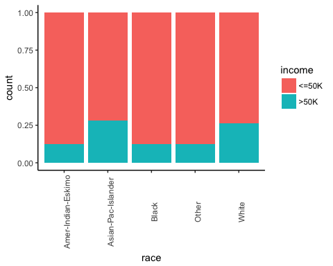
The number of hours work by gender.
# box plot gender working time
ggplot(recast_data, aes(x = gender, y = hours.per.week)) +
    geom_boxplot() +
    stat_summary(fun.y = mean,
        geom = "point",
        size = 3,
        color = "steelblue") +
    theme_classic()
Output:

The box plot confirms that the distribution of working time fits different groups. In the box plot, both genders do not have homogeneous observations.
You can check the density of the weekly working time by type of education. The distributions have many distinct picks. It can probably be explained by the type of contract in the US.
# Plot distribution working time by education
ggplot(recast_data, aes(x = hours.per.week)) +
    geom_density(aes(color = education), alpha = 0.5) +
    theme_classic()
Code Explanation
- ggplot(recast_data, aes( x= hours.per.week)): A density plot only requires one variable
- geom_density(aes(color = education), alpha =0.5): The geometric object to control the density
Output:

To confirm your thoughts, you can perform a one-way ANOVA test:
anova <- aov(hours.per.week~education, recast_data)
summary(anova)
Output:
##                Df Sum Sq Mean Sq F value Pr(>F)
## education       5   1552  310.31   321.2 <2e-16 ***
## Residuals   45531  43984    0.97
## ---
## Signif. codes:  0 '***' 0.001 '**' 0.01 '*' 0.05 '.' 0.1 ' ' 1
The ANOVA test confirms the difference in average between groups.
Non-linearity
Before you run the model, you can see if the number of hours worked is related to age.
library(ggplot2)
ggplot(recast_data, aes(x = age, y = hours.per.week)) +
    geom_point(aes(color = income),
        size = 0.5) +
    stat_smooth(method = 'lm',
        formula = y~poly(x, 2),
        se = TRUE,
        aes(color = income)) +
    theme_classic()
Code Explanation
- ggplot(recast_data, aes(x = age, y = hours.per.week)): Set the aesthetic of the graph
- geom_point(aes(color= income), size =0.5): Construct the dot plot
- stat_smooth(): Add the trend line with the following arguments:
- method=’lm’: Plot the fitted value if the linear regression
- formula = y~poly(x,2): Fit a polynomial regression
- se = TRUE: Add the standard error
- aes(color= income): Break the model by income
Output:

In a nutshell, you can test interaction terms in the model to pick up the non-linearity effect between the weekly working time and other features. It is important to detect under which condition the working time differs.
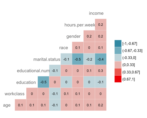
Correlation
The next check is to visualize the correlation between the variables. You convert the factor level type to numeric so that you can plot a heat map containing the coefficient of correlation computed with the Spearman method.
library(GGally)
# Convert data to numeric
corr <- data.frame(lapply(recast_data, as.integer))
# Plot the graphggcorr(corr,
    method = c("pairwise", "spearman"),
    nbreaks = 6,
    hjust = 0.8,
    label = TRUE,
    label_size = 3,
    color = "grey50")
Code Explanation
- data.frame(lapply(recast_data,as.integer)): Convert data to numeric
- ggcorr() plot the heat map with the following arguments:
- method: Method to compute the correlation
- nbreaks = 6: Number of break
- hjust = 0.8: Control position of the variable name in the plot
- label = TRUE: Add labels in the center of the windows
- label_size = 3: Size labels
- color = “grey50”): Color of the label
Output:
Step 5) Train/test set
Any supervised machine learning task requires you to split the data between a train set and a test set. You can use the “function” you created in the other supervised learning tutorials to create a train/test set.
set.seed(1234)
create_train_test <- function(data, size = 0.8, train = TRUE) {
    n_row = nrow(data)
    total_row = size * n_row
    train_sample <- 1: total_row
    if (train == TRUE) {
        return (data[train_sample, ])
    } else {
        return (data[-train_sample, ])
    }
}
data_train <- create_train_test(recast_data, 0.8, train = TRUE)
data_test <- create_train_test(recast_data, 0.8, train = FALSE)
dim(data_train)
Output:
## [1] 36429 9
dim(data_test)
Output:
## [1] 9108 9
Step 6) Build the model
To see how the algorithm performs, you use the glm() function from the stats package. The Generalized Linear Model is a collection of models. The basic syntax is:
glm(formula, data=data, family=linkfunction()
Argument:
- formula:  Equation used to fit the model- data: dataset used
- Family:     - binomial: (link = "logit")
- gaussian: (link = "identity")
- Gamma:    (link = "inverse")
- inverse.gaussian: (link = "1/mu^2")
- poisson:  (link = "log")
- quasi:    (link = "identity", variance = "constant")
- quasibinomial:    (link = "logit")
- quasipoisson: (link = "log")
You are ready to estimate the logistic model to split the income level between a set of features.
formula <- income~.
logit <- glm(formula, data = data_train, family = 'binomial')
summary(logit)
Code Explanation
- formula <- income ~ .: Create the model to fit
- logit <- glm(formula, data = data_train, family = ‘binomial’): Fit a logistic model (family = ‘binomial’) with the data_train data.
- summary(logit): Print the summary of the model
Output:
##
## Call:
## glm(formula = formula, family = "binomial", data = data_train)
## ## Deviance Residuals:
##     Min       1Q   Median       3Q      Max
## -2.6456  -0.5858  -0.2609  -0.0651   3.1982
##
## Coefficients:
##                           Estimate Std. Error z value Pr(>|z|)
## (Intercept)                0.07882    0.21726   0.363  0.71675
## age                        0.41119    0.01857  22.146  < 2e-16 ***
## workclassLocal-gov        -0.64018    0.09396  -6.813 9.54e-12 ***
## workclassPrivate          -0.53542    0.07886  -6.789 1.13e-11 ***
## workclassSelf-emp-inc     -0.07733    0.10350  -0.747  0.45499
## workclassSelf-emp-not-inc -1.09052    0.09140 -11.931  < 2e-16 ***
## workclassState-gov        -0.80562    0.10617  -7.588 3.25e-14 ***
## workclassWithout-pay      -1.09765    0.86787  -1.265  0.20596
## educationCommunity        -0.44436    0.08267  -5.375 7.66e-08 ***
## educationHighGrad         -0.67613    0.11827  -5.717 1.08e-08 ***
## educationMaster            0.35651    0.06780   5.258 1.46e-07 ***
## educationPhD               0.46995    0.15772   2.980  0.00289 **
## educationdropout          -1.04974    0.21280  -4.933 8.10e-07 ***
## educational.num            0.56908    0.07063   8.057 7.84e-16 ***
## marital.statusNot_married -2.50346    0.05113 -48.966  < 2e-16 ***
## marital.statusSeparated   -2.16177    0.05425 -39.846  < 2e-16 ***
## marital.statusWidow       -2.22707    0.12522 -17.785  < 2e-16 ***
## raceAsian-Pac-Islander     0.08359    0.20344   0.411  0.68117
## raceBlack                  0.07188    0.19330   0.372  0.71001
## raceOther                  0.01370    0.27695   0.049  0.96054
## raceWhite                  0.34830    0.18441   1.889  0.05894 .
## genderMale                 0.08596    0.04289   2.004  0.04506 *
## hours.per.week             0.41942    0.01748  23.998  < 2e-16 ***
## ---## Signif. codes:  0 '***' 0.001 '**' 0.01 '*' 0.05 '.' 0.1 ' ' 1
## ## (Dispersion parameter for binomial family taken to be 1)
## ##     Null deviance: 40601  on 36428  degrees of freedom
## Residual deviance: 27041  on 36406  degrees of freedom
## AIC: 27087
##
## Number of Fisher Scoring iterations: 6
The summary of our model reveals interesting information. The performance of a logistic regression is evaluated with specific key metrics.
- AIC (Akaike Information Criteria): This is the equivalent of R2 in logistic regression. It measures the fit when a penalty is applied to the number of parameters. Smaller AIC values indicate the model is closer to the truth.
- Null deviance: Fits the model only with the intercept. The degree of freedom is n-1. We can interpret it as a Chi-square value (fitted value different from the actual value hypothesis testing).
- Residual Deviance: Model with all the variables. It is also interpreted as a Chi-square hypothesis testing.
- Number of Fisher Scoring iterations: Number of iterations before converging.
The output of the glm() function is stored in a list. The code below shows all the items available in the logit variable we constructed to evaluate the logistic regression.
# The list is very long, print only the first three elements
lapply(logit, class)[1:3]
Output:
## $coefficients
## [1] "numeric"
##
## $residuals
## [1] "numeric"
##
## $fitted.values
## [1] "numeric"
Each value can be extracted with the $ sign follow by the name of the metrics. For instance, you stored the model as logit. To extract the AIC criteria, you use:
logit$aic
Output:
## [1] 27086.65
Step 7) Assess the performance of the model
Confusion Matrix
The confusion matrix is a better choice to evaluate the classification performance compared with the different metrics you saw before. The general idea is to count the number of times True instances are classified are False.

To compute the confusion matrix, you first need to have a set of predictions so that they can be compared to the actual targets.
predict <- predict(logit, data_test, type = 'response')
# confusion matrix
table_mat <- table(data_test$income, predict > 0.5)
table_mat
Code Explanation
- predict(logit,data_test, type = ‘response’): Compute the prediction on the test set. Set type = ‘response’ to compute the response probability.
- table(data_test$income, predict > 0.5): Compute the confusion matrix. predict > 0.5 means it returns 1 if the predicted probabilities are above 0.5, else 0.
Output:
##
##         FALSE TRUE
##   <=50K  6310  495
##   >50K   1074 1229
Each row in a confusion matrix represents an actual target, while each column represents a predicted target. The first row of this matrix considers the income lower than 50k (the negative class): 6,310 observations were correctly classified as individuals with income lower than 50k (True negative), while 495 were wrongly classified as above 50k (False positive). The second row considers the income above 50k: 1,229 were correctly identified (True positive), while 1,074 were missed (False negative).
You can calculate the model accuracy by summing the true positive + true negative over the total observation

accuracy_Test <- sum(diag(table_mat)) / sum(table_mat)
accuracy_Test
Code Explanation
- sum(diag(table_mat)): Sum of the diagonal
- sum(table_mat): Sum of the matrix.
Output:
## [1] 0.8277339
The model appears to suffer from one problem: it produces too many false negatives. This is called the accuracy test paradox. We stated that the accuracy is the ratio of correct predictions to the total number of cases. We can have relatively high accuracy but a useless model. It happens when there is a dominant class. If you look back at the confusion matrix, you can see most of the cases are classified as true negative. Imagine now, the model classified every observation as negative (i.e. lower than 50k). You would still obtain an accuracy of about 75 percent (6,805 / 9,108). Your model performs better but struggles to distinguish the true positive with the true negative.
In such situation, it is preferable to have a more concise metric. We can look at:
- Precision=TP/(TP+FP)
- Recall=TP/(TP+FN)
Precision vs Recall
Precision looks at the accuracy of the positive prediction. Recall is the ratio of positive instances that are correctly detected by the classifier;
You can construct two functions to compute these two metrics
- Construct precision
precision <- function(matrix) {
	# True positive
    tp <- matrix[2, 2]
	# false positive
    fp <- matrix[1, 2]
    return (tp / (tp + fp))
}
Code Explanation
- mat[1,1]: Return the first cell of the first column of the data frame, i.e. the true positive
- mat[1,2]; Return the first cell of the second column of the data frame, i.e. the false positive
recall <- function(matrix) {
# true positive
    tp <- matrix[2, 2]# false positive
    fn <- matrix[2, 1]
    return (tp / (tp + fn))
}
Code Explanation
- mat[1,1]: Return the first cell of the first column of the data frame, i.e. the true positive
- mat[2,1]; Return the second cell of the first column of the data frame, i.e. the false negative
You can test your functions
prec <- precision(table_mat)
prec
rec <- recall(table_mat)
rec
Output:
## [1] 0.712877
## [2] 0.5336518
Read these two numbers carefully. Precision is 0.71, so when the model says an individual earns above 50k, it is correct in 71 percent of the cases. Recall is 0.53, so the model only detects 53 percent of the individuals who truly earn above 50k.
You can create the  score based on the precision and recall. The is a harmonic mean of these two metrics, meaning it gives more weight to the lower values.

f1 <- 2 * ((prec * rec) / (prec + rec))
f1
Output:
## [1] 0.6103799
Precision vs Recall tradeoff
It is impossible to have both a high precision and high recall.
If we increase the precision, the correct individual will be better predicted, but we would miss lots of them (lower recall). In some situation, we prefer higher precision than recall. There is a concave relationship between precision and recall.
- Imagine, you need to predict if a patient has a disease. You want to be as precise as possible.
- If you need to detect potential fraudulent people in the street through facial recognition, it would be better to catch many people labeled as fraudulent even though the precision is low. The police will be able to release the non-fraudulent individual.
The ROC curve
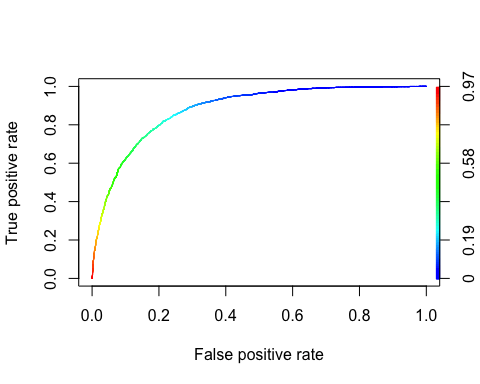
The Receiver Operating Characteristic curve is another common tool used with binary classification. It is very similar to the precision/recall curve, but instead of plotting precision versus recall, the ROC curve shows the true positive rate (i.e., recall) against the false positive rate. The false positive rate is the ratio of negative instances that are incorrectly classified as positive. It is equal to one minus the true negative rate. The true negative rate is also called specificity. Hence the ROC curve plots sensitivity (recall) versus 1-specificity
To plot the ROC curve, we need to install a package called ROCR. We can find in the conda library. You can type the code:
conda install -c r r-rocr --yes
We can plot the ROC with the prediction() and performance() functions.
library(ROCR)
ROCRpred <- prediction(predict, data_test$income)
ROCRperf <- performance(ROCRpred, 'tpr', 'fpr')
plot(ROCRperf, colorize = TRUE, text.adj = c(-0.2, 1.7))
Code Explanation
- prediction(predict, data_test$income): The ROCR library needs to create a prediction object to transform the input data
- performance(ROCRpred, ‘tpr’,’fpr’): Return the two combinations to produce in the graph. Here, tpr and fpr are constructed. Tot plot precision and recall together, use “prec”, “rec”.
Output:
Step 8) Improve the model
You can try to add non-linearity to the model with the interaction between
- age and hours.per.week
- gender and hours.per.week.
You then compare the F1 score of both models.
formula_2 <- income~age: hours.per.week + gender: hours.per.week + .
logit_2 <- glm(formula_2, data = data_train, family = 'binomial')
predict_2 <- predict(logit_2, data_test, type = 'response')
table_mat_2 <- table(data_test$income, predict_2 > 0.5)
precision_2 <- precision(table_mat_2)
recall_2 <- recall(table_mat_2)
f1_2 <- 2 * ((precision_2 * recall_2) / (precision_2 + recall_2))
f1_2
Output:
## [1] 0.6109181
The F1 score is slightly higher than the previous one. You can keep working on the data a try to beat the score.
How to Interpret GLM Coefficients and Odds Ratios in R
The summary table printed in Step 6 reports coefficients on the log-odds scale, which is difficult to explain to a non-technical audience. Converting them into odds ratios makes the model far easier to communicate.
Follow these four steps.
- Exponentiate the coefficients. Apply exp() to every estimate so the log-odds become multiplicative odds ratios.
- Add a confidence interval. Wrap confint() in exp() to obtain the 95 percent interval on the same odds scale.
- Compare each value against 1. An odds ratio above 1 increases the probability of the positive class, a value below 1 decreases it, and a value close to 1 means the predictor adds little.
- Check statistical significance. Only interpret predictors whose p-value in the summary output is below your chosen threshold, typically 0.05.
# Convert log-odds coefficients into odds ratios
odds_ratio <- exp(coef(logit))
round(odds_ratio, 3)

# Odds ratios with 95% confidence intervals
exp(cbind(OddsRatio = coef(logit), confint(logit)))
Reading the output. The coefficient for hours.per.week in our model is 0.41942. Exponentiating it gives exp(0.41942) = 1.52, which means that a one standard deviation increase in weekly working hours multiplies the odds of earning above 50k by roughly 1.5, holding every other variable constant.
Negative coefficients work the same way. marital.statusNot_married is -2.50346, so exp(-2.50346) = 0.08: unmarried individuals hold about 8 percent of the odds of a married individual. Because the continuous predictors were standardized in Step 1, describe changes in standard deviation units, not raw hours.
Note for other families: exponentiated coefficients are odds ratios only under the binomial family with a logit link. With family = “poisson” and a log link, the same exp() values are read as rate ratios instead.
GLM in R: Quick Function Reference
Keep this table beside you while you code. It lists every function used in the eight steps above, together with the package that supplies it and the arguments it expects.
| Package | Objective | Function | Argument |
|---|---|---|---|
| – | Create train/test dataset | create_train_set() | data, size, train |
| glm | Train a Generalized Linear Model | glm() | formula, data, family* |
| glm | Summarize the model | summary() | fitted model |
| base | Make prediction | predict() | fitted model, dataset, type = ‘response’ |
| base | Create a confusion matrix | table() | y, predict() |
| base | Create accuracy score | sum(diag(table())/sum(table() | |
| ROCR | Create ROC : Step 1 Create prediction | prediction() | predict(), y |
| ROCR | Create ROC : Step 2 Create performance | performance() | prediction(), ‘tpr’, ‘fpr’ |
| ROCR | Create ROC : Step 3 Plot graph | plot() | performance() |
The other GLM families available through the family argument are:
- binomial: (link = “logit”)
- gaussian: (link = “identity”)
- Gamma: (link = “inverse”)
- inverse.gaussian: (link = “1/mu^2”)
- poisson: (link = “log”)
- quasi: (link = “identity”, variance = “constant”)
- quasibinomial: (link = “logit”)
- quasipoisson: (link = “log”)
