K-means Clustering in R with Example
What is Cluster analysis?
Cluster analysis is part of the unsupervised learning. A cluster is a group of data that share similar features. We can say, clustering analysis is more about discovery than a prediction. The machine searches for similarity in the data. For instance, you can use cluster analysis for the following application:
- Customer segmentation: Looks for similarity between groups of customers
- Stock Market clustering: Group stock based on performances
- Reduce dimensionality of a dataset by grouping observations with similar values
Clustering analysis is not too difficult to implement and is meaningful as well as actionable for business.
The most striking difference between supervised and unsupervised learning lies in the results. Unsupervised learning creates a new variable, the label, while supervised learning predicts an outcome. The machine helps the practitioner in the quest to label the data based on close relatedness. It is up to the analyst to make use of the groups and give a name to them.
Let’s make an example to understand the concept of clustering. For simplicity, we work in two dimensions. You have data on the total spend of customers and their ages. To improve advertising, the marketing team wants to send more targeted emails to their customers.
In the following graph, you plot the total spend and the age of the customers.
library(ggplot2)
df <- data.frame(age = c(18, 21, 22, 24, 26, 26, 27, 30, 31, 35, 39, 40, 41, 42, 44, 46, 47, 48, 49, 54),
    spend = c(10, 11, 22, 15, 12, 13, 14, 33, 39, 37, 44, 27, 29, 20, 28, 21, 30, 31, 23, 24)
)
ggplot(df, aes(x = age, y = spend)) +
    geom_point()

A pattern is visible at this point
- At the bottom-left, you can see young people with a lower purchasing power
- Upper-middle reflects people with a job that they can afford spend more
- Finally, older people with a lower budget.

In the figure above, you cluster the observations by hand and define each of the three groups. This example is somewhat straightforward and highly visual. If new observations are appended to the data set, you can label them within the circles. You define the circle based on our judgment. Instead, you can use Machine Learning to group the data objectively.
In this tutorial, you will learn how to use the k-means algorithm.
K-means algorithm
K-mean is, without doubt, the most popular clustering method. Researchers released the algorithm decades ago, and lots of improvements have been done to k-means.
The algorithm tries to find groups by minimizing the distance between the observations, called local optimal solutions. The distances are measured based on the coordinates of the observations. For instance, in a two-dimensional space, the coordinates are simple and .
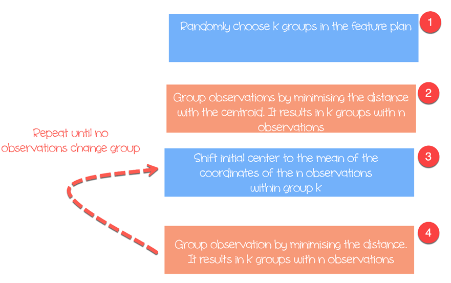
The algorithm works as follow:
- Step 1: Choose groups in the feature plan randomly
- Step 2: Minimize the distance between the cluster center and the different observations (centroid). It results in groups with observations
- Step 3: Shift the initial centroid to the mean of the coordinates within a group.
- Step 4: Minimize the distance according to the new centroids. New boundaries are created. Thus, observations will move from one group to another
- Repeat until no observation changes groups
K-means usually takes the Euclidean distance between the feature and feature :

Different measures are available such as the Manhattan distance or Minlowski distance. Note that, K-mean returns different groups each time you run the algorithm. Recall that the first initial guesses are random and compute the distances until the algorithm reaches a homogeneity within groups. That is, k-mean is very sensitive to the first choice, and unless the number of observations and groups are small, it is almost impossible to get the same clustering.
Select the number of clusters
Another difficulty found with k-mean is the choice of the number of clusters. You can set a high value of , i.e. a large number of groups, to improve stability but you might end up with overfit of data. Overfitting means the performance of the model decreases substantially for new coming data. The machine learnt the little details of the data set and struggle to generalize the overall pattern.
The number of clusters depends on the nature of the data set, the industry, business and so on. However, there is a rule of thumb to select the appropriate number of clusters:
![]()
with equals to the number of observation in the dataset.
Generally speaking, it is interesting to spend times to search for the best value of to fit with the business need.
We will use the Prices of Personal Computers dataset to perform our clustering analysis. This dataset contains 6259 observations and 10 features. The dataset observes the price from 1993 to 1995 of 486 personal computers in the US. The variables are price, speed, ram, screen, cd among other.
You will proceed as follow:
- Import data
- Train the model
- Evaluate the model
Import data
K means is not suitable for factor variables because it is based on the distance and discrete values do not return meaningful values. You can delete the three categorical variables in our dataset. Besides, there are no missing values in this dataset.
library(dplyr)
PATH <-"https://raw.githubusercontent.com/guru99-edu/R-Programming/master/computers.csv"
df <- read.csv(PATH) %>%
select(-c(X, cd, multi, premium))
glimpse(df)
Output
## Observations: 6, 259
## Variables: 7
## $ price < int > 1499, 1795, 1595, 1849, 3295, 3695, 1720, 1995, 2225, 2...
##$ speed < int > 25, 33, 25, 25, 33, 66, 25, 50, 50, 50, 33, 66, 50, 25, ...
##$ hd < int > 80, 85, 170, 170, 340, 340, 170, 85, 210, 210, 170, 210...
##$ ram < int > 4, 2, 4, 8, 16, 16, 4, 2, 8, 4, 8, 8, 4, 8, 8, 4, 2, 4, ...
##$ screen < int > 14, 14, 15, 14, 14, 14, 14, 14, 14, 15, 15, 14, 14, 14, ...
##$ ads < int > 94, 94, 94, 94, 94, 94, 94, 94, 94, 94, 94, 94, 94, 94, ...
## $ trend  <int> 1, 1, 1, 1, 1, 1, 1, 1, 1, 1, 1, 1, 1, 1, 1, 1, 1, 1, 1...
From the summary statistics, you can see the data has large values. A good practice with k mean and distance calculation is to rescale the data so that the mean is equal to one and the standard deviation is equal to zero.
summary(df)
Output:
##      price          speed              hd              ram
##  Min.   : 949   Min.   : 25.00   Min.   :  80.0   Min.   : 2.000
##  1st Qu.:1794   1st Qu.: 33.00   1st Qu.: 214.0   1st Qu.: 4.000  `
##  Median :2144   Median : 50.00   Median : 340.0   Median : 8.000
##  Mean   :2220   Mean   : 52.01   Mean   : 416.6   Mean   : 8.287
##  3rd Qu.:2595   3rd Qu.: 66.00   3rd Qu.: 528.0   3rd Qu.: 8.000
##  Max.   :5399   Max.   :100.00   Max.   :2100.0   Max.   :32.000
##      screen           ads            trend
##  Min.   :14.00   Min.   : 39.0   Min.   : 1.00
##  1st Qu.:14.00   1st Qu.:162.5   1st Qu.:10.00
##  Median :14.00   Median :246.0   Median :16.00
##  Mean   :14.61   Mean   :221.3   Mean   :15.93
##  3rd Qu.:15.00   3rd Qu.:275.0   3rd Qu.:21.50
##  Max.   :17.00   Max.   :339.0   Max.   :35.00
You rescale the variables with the scale() function of the dplyr library. The transformation reduces the impact of outliers and allows to compare a sole observation against the mean. If a standardized value (or z-score) is high, you can be confident that this observation is indeed above the mean (a large z-score implies that this point is far away from the mean in term of standard deviation. A z-score of two indicates the value is 2 standard deviations away from the mean. Note, the z-score follows a Gaussian distribution and is symmetrical around the mean.
rescale_df <- df % > %
mutate(price_scal = scale(price),
    hd_scal = scale(hd),
    ram_scal = scale(ram),
    screen_scal = scale(screen),
    ads_scal = scale(ads),
    trend_scal = scale(trend)) % > %
select(-c(price, speed, hd, ram, screen, ads, trend))
R base has a function to run the k mean algorithm. The basic function of k mean is:
kmeans(df, k)
arguments:
-df: dataset used to run the algorithm
-k: Number of clusters
Train the model
In figure three, you detailed how the algorithm works. You can see each step graphically with the great package build by Yi Hui (also creator of Knit for Rmarkdown). The package animation is not available in the conda library. You can use the other way to install the package with install.packages(“animation”). You can check if the package is installed in our Anaconda folder.
install.packages("animation")
After you load the library, you add .ani after kmeans and R will plot all the steps. For illustration purpose, you only run the algorithm with the rescaled variables hd and ram with three clusters.
set.seed(2345)
library(animation)
kmeans.ani(rescale_df[2:3], 3)
Code Explanation
- kmeans.ani(rescale_df[2:3], 3): Select the columns 2 and 3 of rescale_df data set and run the algorithm with k sets to 3. Plot the animation.


You can interpret the animation as follow:
- Step 1: R randomly chooses three points
- Step 2: Compute the Euclidean distance and draw the clusters. You have one cluster in green at the bottom left, one large cluster colored in black at the right and a red one between them.
- Step 3: Compute the centroid, i.e. the mean of the clusters
- Repeat until no data changes cluster
The algorithm converged after seven iterations. You can run the k-mean algorithm in our dataset with five clusters and call it pc_cluster.
pc_cluster <-kmeans(rescale_df, 5)
- The list pc_cluster contains seven interesting elements:
- pc_cluster$cluster: Indicates the cluster of each observation
- pc_cluster$centers: The cluster centres
- pc_cluster$totss: The total sum of squares
- pc_cluster$withinss: Within sum of square. The number of components return is equal to `k`
- pc_cluster$tot.withinss: Sum of withinss
- pc_clusterbetweenss: Total sum of square minus Within sum of square
- pc_cluster$size: Number of observation within each cluster
You will use the sum of the within sum of square (i.e. tot.withinss) to compute the optimal number of clusters k. Finding k is indeed a substantial task.
Optimal k
One technique to choose the best k is called the elbow method. This method uses within-group homogeneity or within-group heterogeneity to evaluate the variability. In other words, you are interested in the percentage of the variance explained by each cluster. You can expect the variability to increase with the number of clusters, alternatively, heterogeneity decreases. Our challenge is to find the k that is beyond the diminishing returns. Adding a new cluster does not improve the variability in the data because very few information is left to explain.
In this tutorial, we find this point using the heterogeneity measure. The Total within clusters sum of squares is the tot.withinss in the list return by kmean().
You can construct the elbow graph and find the optimal k as follow:
- Step 1: Construct a function to compute the total within clusters sum of squares
- Step 2: Run the algorithm times
- Step 3: Create a data frame with the results of the algorithm
- Step 4: Plot the results
Step 1) Construct a function to compute the total within clusters sum of squares
You create the function that runs the k-mean algorithm and store the total within clusters sum of squares
kmean_withinss <- function(k) {
    cluster <- kmeans(rescale_df, k)
    return (cluster$tot.withinss)
}
Code Explanation
- function(k): Set the number of arguments in the function
- kmeans(rescale_df, k): Run the algorithm k times
- return(cluster$tot.withinss): Store the total within clusters sum of squares
You can test the function with equals 2.
Output:
## Try with 2 cluster
kmean_withinss(2)
Output:
## [1] 27087.07
Step 2) Run the algorithm n times
You will use the sapply() function to run the algorithm over a range of k. This technique is faster than creating a loop and store the value.
# Set maximum cluster
max_k <-20
# Run algorithm over a range of k
wss <- sapply(2:max_k, kmean_withinss)
Code Explanation
- max_k <-20: Set a maximum number of to 20
- sapply(2:max_k, kmean_withinss): Run the function kmean_withinss() over a range 2:max_k, i.e. 2 to 20.
Step 3) Create a data frame with the results of the algorithm
Post creation and testing our function, you can run the k-mean algorithm over a range from 2 to 20, store the tot.withinss values.
# Create a data frame to plot the graph
elbow <-data.frame(2:max_k, wss)
Code Explanation
- data.frame(2:max_k, wss): Create a data frame with the output of the algorithm store in wss
Step 4) Plot the results
You plot the graph to visualize where is the elbow point
# Plot the graph with gglop
ggplot(elbow, aes(x = X2.max_k, y = wss)) +
    geom_point() +
    geom_line() +
    scale_x_continuous(breaks = seq(1, 20, by = 1))

From the graph, you can see the optimal k is seven, where the curve is starting to have a diminishing return.
Once you have our optimal k, you re-run the algorithm with k equals to 7 and evaluate the clusters.
Examining the cluster
pc_cluster_2 <-kmeans(rescale_df, 7)
As mention before, you can access the remaining interesting information in the list returned by kmean().
pc_cluster_2$cluster
pc_cluster_2$centers
pc_cluster_2$size
The evaluation part is subjective and relies on the use of the algorithm. Our goal here is to gather computer with similar features. A computer guy can do the job by hand and group computer based on his expertise. However, the process will take lots of time and will be error prone. K-mean algorithm can prepare the field for him/her by suggesting clusters.
As a prior evaluation, you can examine the size of the clusters.
pc_cluster_2$size
Output:
## [1] 608 1596 1231 580 1003 699 542
The first cluster is composed of 608 observations, while the smallest cluster, number 4, has only 580 computers. It might be good to have homogeneity between clusters, if not, a thinner data preparation might be required.
You get a deeper look at the data with the center component. The rows refer to the numeration of the cluster and the columns the variables used by the algorithm. The values are the average score by each cluster for the interested column. Standardization makes the interpretation easier. Positive values indicate the z-score for a given cluster is above the overall mean. For instance, cluster 2 has the highest price average among all the clusters.
center <-pc_cluster_2$centers
center
Output:
##   price_scal    hd_scal     ram_scal screen_scal   ads_scal trend_scal
## 1 -0.6372457 -0.7097995 -0.691520682  -0.4401632  0.6780366 -0.3379751
## 2 -0.1323863  0.6299541  0.004786730   2.6419582 -0.8894946  1.2673184
## 3  0.8745816  0.2574164  0.513105797  -0.2003237  0.6734261 -0.3300536
## 4  1.0912296 -0.2401936  0.006526723   2.6419582  0.4704301 -0.4132057
## 5 -0.8155183  0.2814882 -0.307621003  -0.3205176 -0.9052979  1.2177279
## 6  0.8830191  2.1019454  2.168706085   0.4492922 -0.9035248  1.2069855
## 7  0.2215678 -0.7132577 -0.318050275  -0.3878782 -1.3206229 -1.5490909
You can create a heat map with ggplot to help us highlight the difference between categories.
The default colors of ggplot need to be changed with the RColorBrewer library. You can use the conda library and the code to launch in the terminal:
conda install -c r r-rcolorbrewer
To create a heat map, you proceed in three steps:
- Build a data frame with the values of the center and create a variable with the number of the cluster
- Reshape the data with the gather() function of the tidyr library. You want to transform data from wide to long.
- Create the palette of colors with colorRampPalette() function
Step 1) Build a data frame
Let’s create the reshape dataset
library(tidyr)

# create dataset with the cluster number

cluster <- c(1: 7)
center_df <- data.frame(cluster, center)

# Reshape the data

center_reshape <- gather(center_df, features, values, price_scal: trend_scal)
head(center_reshape)
Output:
##   cluster   features     values
## 1       1 price_scal -0.6372457
## 2       2 price_scal -0.1323863
## 3       3 price_scal  0.8745816
## 4       4 price_scal  1.0912296
## 5       5 price_scal -0.8155183
## 6       6 price_scal  0.8830191
Step 2) Reshape the data
The code below create the palette of colors you will use to plot the heat map.
library(RColorBrewer)
# Create the palette
hm.palette <-colorRampPalette(rev(brewer.pal(10, 'RdYlGn')),space='Lab')
Step 3) Visualize
You can plot the graph and see what the clusters look like.
# Plot the heat map
ggplot(data = center_reshape, aes(x = features, y = cluster, fill = values)) +
    scale_y_continuous(breaks = seq(1, 7, by = 1)) +
    geom_tile() +
    coord_equal() +
    scale_fill_gradientn(colours = hm.palette(90)) +
    theme_classic()

Summary
We can summarize the k-mean algorithm in the table below
| Package | Objective | Function | Argument |
|---|---|---|---|
| base | Train k-mean | kmeans() | df, k |
| Access cluster | kmeans()$cluster | ||
| Cluster centers | kmeans()$centers | ||
| Size cluster | kmeans()$size |