
How to Create Charts in Excel: Types & Examples
 Editorial Team
⚡ Smart Summary
Charts in Excel turn rows and columns of numbers into a visual that reveals trends and comparisons at a glance. This page explains what a chart is, the main chart types and when to use each, the parts of a chart, and a step by step column chart example.
A picture is worth of thousand words; a chart is worth of thousand sets of data. In this tutorial, we are going to learn how we can use graph in Excel to visualize our data.
What is a chart?
A chart is a visual representative of data in both columns and rows. Charts are usually used to analyse trends and patterns in data sets. Let’s say you have been recording the sales figures in Excel for the past three years. Using charts, you can easily tell which year had the most sales and which year had the least. You can also draw charts to compare set targets against actual achievements.
We will use the following data for this tutorial.
Note: we will be using Excel 2013. If you have a lower version, then some of the more advanced features may not be available to you.
| Item | 2012 | 2013 | 2014 | 2015 |
|---|---|---|---|---|
| Desktop Computers | 20 | 12 | 13 | 12 |
| Laptops | 34 | 45 | 40 | 39 |
| Monitors | 12 | 10 | 17 | 15 |
| Printers | 78 | 13 | 90 | 14 |
Types of Charts in MS Excel
Different scenarios require different types of charts. Towards this end, Excel provides a number of chart types that you can work with. The type of chart that you choose depends on the type of data that you want to visualize. To help simplify things for the users, Excel 2013 and above has an option that analyses your data and makes a recommendation of the chart type that you should use.
The following table shows some of the most commonly used Excel charts and when you should consider using them.
| S/N | CHART TYPE | WHEN SHOULD I USE IT? | |
|---|---|---|---|
| 1 | Pie Chart | When you want to quantify items and show them as percentages. |
|
| 2 | Bar Chart | When you want to compare values across a few categories. The values run horizontally |
|
| 3 | Column chart | When you want to compare values across a few categories. The values run vertically |
|
| 4 | Line chart | When you want to visualize trends over a period of time i.e. months, days, years, etc. |
|
| 5 | Combo Chart | When you want to highlight different types of information |
|


The importance of charts
- Allows you to visualize data graphically
- It’s easier to analyse trends and patterns using charts in MS Excel
- Easy to interpret compared to data in cells
Parts of an Excel Chart
Before creating a chart, it helps to know the elements that make it readable. Each element can be switched on or off from the Chart Elements button, the plus sign that appears next to a selected chart.
| Element | Purpose |
|---|---|
| Chart title | Names the chart so the reader knows what it shows |
| Axis titles | Label the horizontal category axis and the vertical value axis |
| Legend | Identifies which colour belongs to which data series |
| Data labels | Print the exact value on each bar, column, or slice |
| Gridlines | Light lines that help the eye read a value against the axis |
| Data series | The set of related values, such as the sales of one product across the years |
💡 Tip: Add data labels when the exact numbers matter, and remove gridlines for a cleaner look. Both are toggled from the Chart Elements plus sign without touching the source data.
Step by step example of creating charts in Excel
In this tutorial, we are going to plot a simple column chart in Excel that will display the sold quantities against the sales year. Below are the steps to create chart in MS Excel:
- Open Excel
- Enter the data from the sample data table above
- Your workbook should now look as follows

To get the desired chart you have to follow the following steps
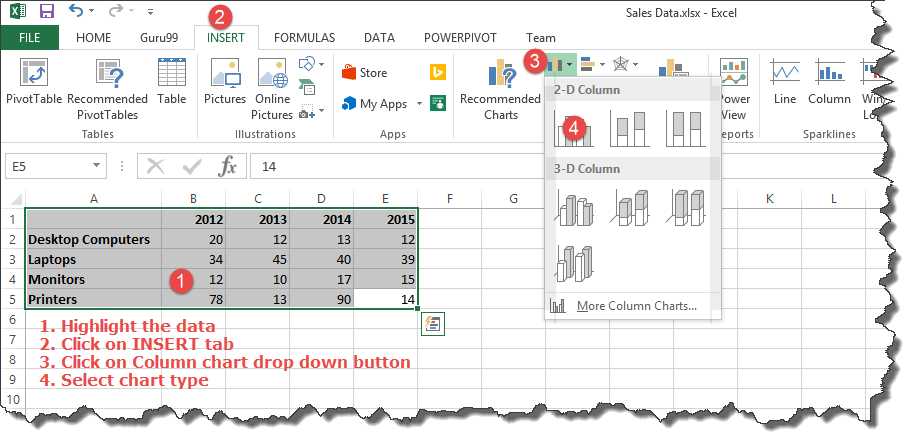
- Select the data you want to represent in graph
- Click on INSERT tab from the ribbon
- Click on the Column chart drop down button
- Select the chart type you want
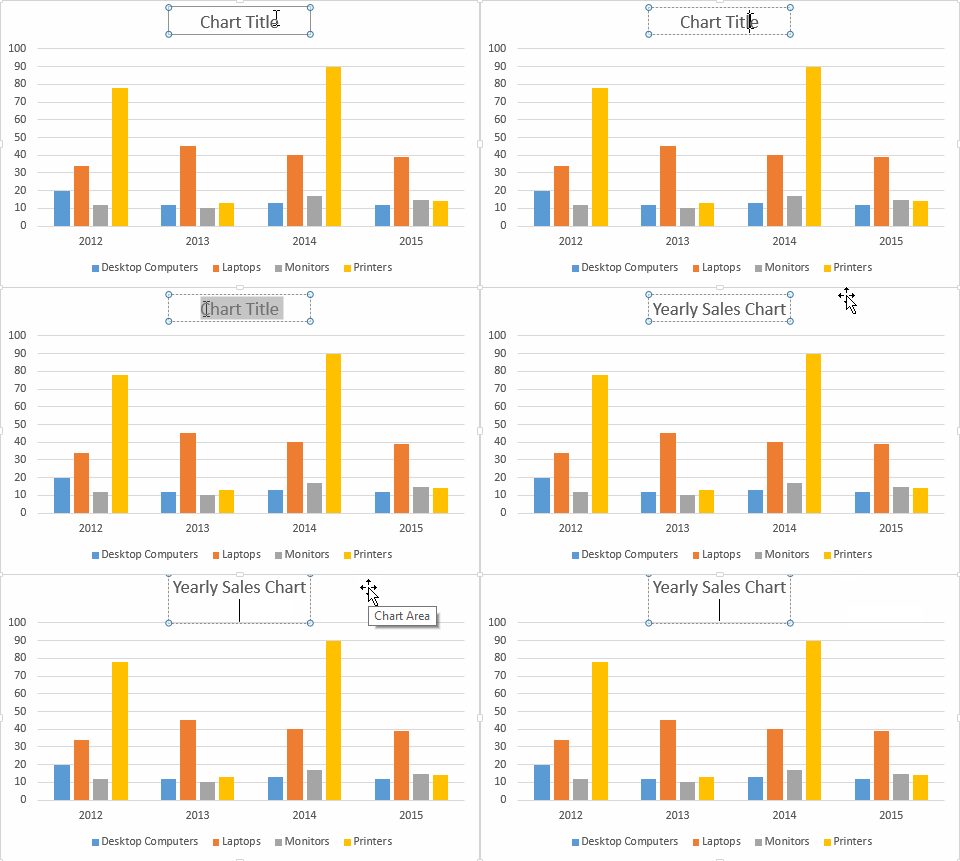
You should be able to see the following chart
Tutorial Exercise
When you select the chart, the ribbon activates the following tab

Try to apply the different chart styles, and other options presented in your chart.
Download the above Excel Template
