
Advanced Excel Charts & Graphs [With Template]
 Editorial Team
⚡ Smart Summary
Advanced Charts in Excel go beyond the basic chart by combining more than one data set on a single graph. This page explains what an advanced chart is, builds a combo chart of articles published against site traffic, and adds a secondary axis with axis titles.

Graphics, images, and charts are great ways to visualize and represent the data, and Excel does exactly same thing for us by automatically creating the charts. There may be times when we would like to go beyond the basic charts that excel creates for us. This tutorial will focus on that complexity.
What is an advanced chart?
An advanced chart is a chart that goes beyond the basic charts created by Excel. Let’s say you have more than one set of data that you would like to compare on the same chart, you can create your basic chart with one set of data then add more datasets to it and apply other items i.e. formatting to the chart. This is what advanced charts are all about.
The importance of advanced charts
- They provide consolidated information in a single chart that makes it easier to compare more than one data set and make decisions quickly for complex charts in Excel
- They allow us to customize the look and feel of the professional Excel charts
Common Advanced Chart Types in Excel
The combo chart built below is the most common advanced chart, but Excel offers several others for specific jobs. The table shows when to reach for each one.
| Chart type | Best used for |
|---|---|
| Combo chart | Two series of different kinds, such as a column and a line, on one chart |
| Secondary axis chart | Two series with very different scales, such as a count and a percentage |
| Waterfall | How a starting value rises and falls to a final total, such as cash flow |
| Pareto | The few categories that account for most of the total, using the 80/20 rule |
| Histogram | The frequency of values grouped into ranges, such as ages or scores |
| Sparkline | A tiny trend line inside a single cell, next to the data |
💡 Tip: Most of these appear under Insert then Recommended Charts or the Charts group. The sparkline is the exception, and is added from the Insert, Sparklines group instead.
Step by step example of creating advanced charts
In this Excel Charts tutorial exercise, we will assume that we run a blog and have software that gives us the number of monthly visitors. We would like to see the relationship between the numbers of articles published per month vs the total month traffic. We will work with the following data set.
Step 1) Create a new workbook in Excel
- Enter the data shown above
- Create a basic column chart as shown below. If you do not know how to create a basic chart, then read the article on charts.
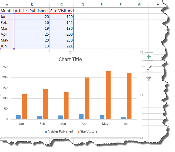
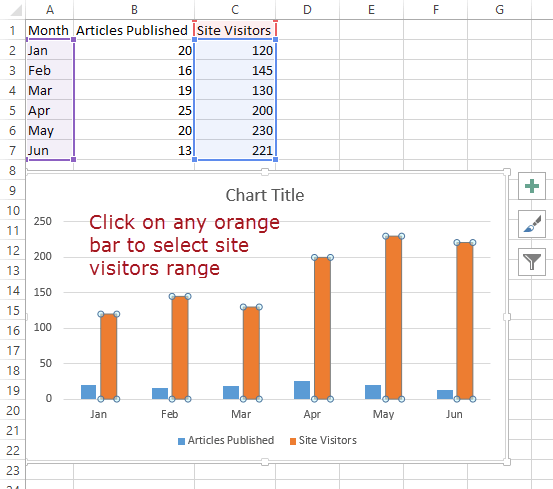
Step 2) Now, it’s time for our charts and complex graphs in Excel to take beyond the basics. Select the orange bars representing traffic
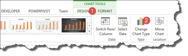
Step 3) Click on change chart type as shown below
- You will get the following dialog window
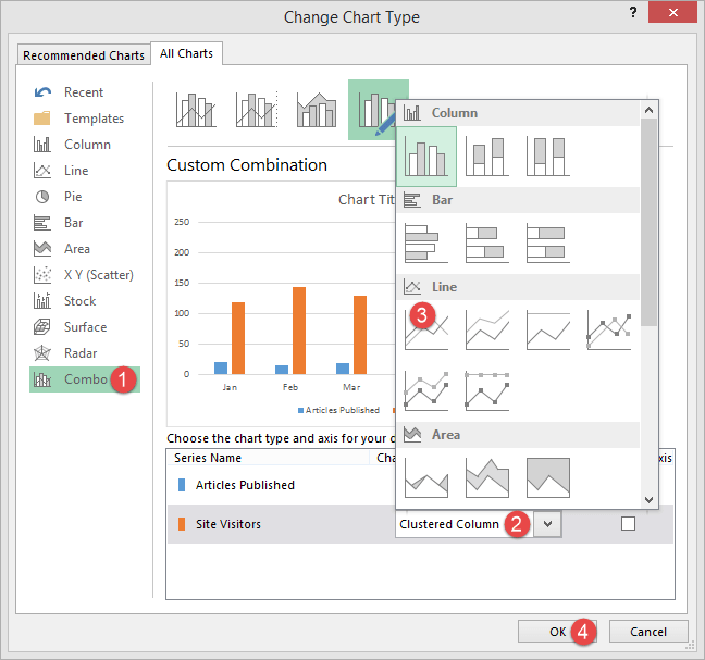
Step 4) Select Combo and,
- Click on the clustered column
- Select Line chart
- Click on OK button

Congratulations, you just created a creative Excel chart with two types of charts in it.
Let’s now add a secondary axis to our chart to make it look more presentable.
- Select the chart
- Click on Design under chart tools and select change chart type
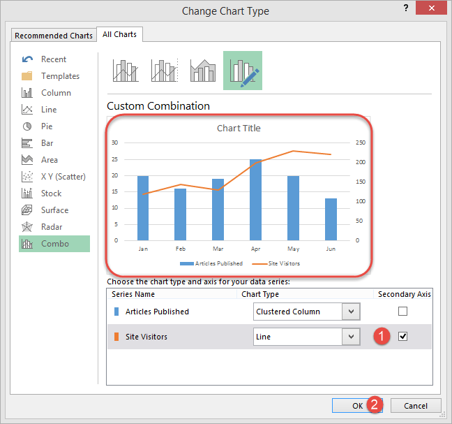
- Click on Secondary Axis check box under Site Visitors
- Click on OK button
Let’s now edit the chart, primary and secondary axis titles as shown below.
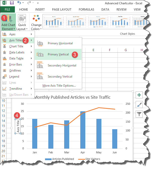
- Go to Add chart elements
- Click on Axis titles
- Select primary verticals
- Double click on the chart title and edit the title
Write Monthly Published Articles vs Site Traffic. Your complete chart should now look as follows
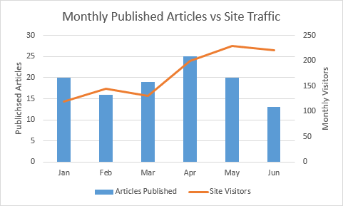
As you can see from the above complete chart, we have consolidated two data sets and visualized them in such a way that it easily shows the effect of one data set onto the other using Excel graphs.
Advanced Excel Charts and Graphs Template
