
How to Create Pivot Table in Excel: Beginners Tutorial
 Editorial Team
⚡ Smart Summary
Pivot Tables in Excel summarize a large dataset into a compact report of totals, averages, and other aggregates. This page explains what a pivot table is, builds one step by step from sales data, creates a two dimensional pivot table, and generates a pivot chart.

There will be times when you will be required to analyse large amounts of data and produce easy to read and understand reports. Pivot tables allow us to analyse such data and produce reports that meet our business reporting requirements.
What is a Pivot Table?
A Pivot Table is a summary of a large dataset that usually includes the total figures, average, minimum, maximum, etc. let’s say you have a sales data for different regions, with a pivot table, you can summarize the data by region and find the average sales per region, the maximum and minimum sale per region, etc. Pivot tables allow us to analyse, summarize and show only relevant data in our reports.
The Four Areas of a Pivot Table
Every pivot table is built by dragging the fields of the source data into one of four areas in the field list. Understanding these areas makes the steps that follow easier to picture.
| Area | What it does | Example |
|---|---|---|
| Rows | Lists the categories down the left side, one per row | Company name |
| Columns | Spreads a second category across the top | Customer name |
| Values | The numbers that are aggregated, using SUM, AVERAGE, MIN, or MAX | Sum of SubTotal |
| Filters | Limits the whole table to a chosen value | Show one product only |
💡 Tip: A field placed in both Rows and Columns creates the two dimensional table shown later. Change the aggregate in the Values area by clicking the field and choosing Value Field Settings, then pick Average, Count, Max, or Min.
Step by Step tutorial on creating pivot tables
The image below shows the sample sales data collated from North wind access database.

You can download the sample Excel data here.
Download the above Excel Data File
As you can see from the above image, our spreadsheet contains a lot of data. Let’s say we want to create a summary of customers, group all of their orders by product, and show the quantities, unit price and subtotals for all the transactions.
- Open the Excel file that you downloaded
- Click on INSERT tab on the ribbon
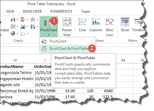
- You will get the following window
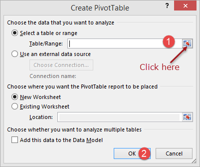
- Click on the select table/range button as shown in the image above
- You will get the following mini window

- Click in cell address A1
- Press Ctrl + A on the keyboard to select all the data cells
- Your mini window shown now appear as follows

- Click on Close button to get back to the options window
- Click on OK button

-
Select the following fields
- CompanyName
- Product Name
- UnitPrice
- Quantity
- SubTotal
- Your worksheet should now look as follows

- Note the above data has been grouped by customer company name, product name, unit price, sum of quantities and the sum of the subtotals.
- Notice the drop down button next to Rows Labels. This button allows us to sort/filter our data. Let’s assume we are only interested in Alfreds Futterkiste
- Click on the Row Labels drop down list as shown below
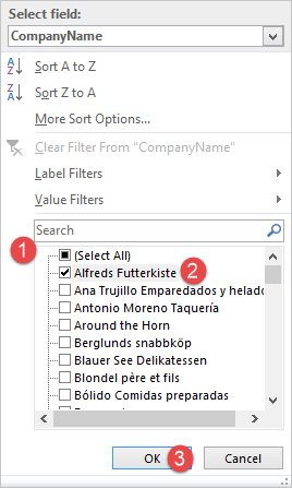
- Remove the tick from (Select All)
- Select Alfreds Futterkiste
- Click on OK button
- You will get the following data

2-Dimensional pivot tables
A two-dimensional pivot table is a table that has fields on both rows and columns. Let’s say we want to list employee names as rows and use columns to represent customer names and fill in the cells with the total sales.
- Activate the Sales Datasheet
- Click on INSERT tab
- Click on Pivot Chart & Table button
- Select all the data. Excel should now remember the previous range so you just have to click on OK button
- A new sheet will be created with the pivot table tools
- Select the fields as shown in the image below

Your pivot table will now look as follows

Visualizing pivot table data using charts
With Excel 2013, you do not need to create the charts manually. Excel will create the charts for you as you create your pivot tables, change aggregate functions, apply filters, etc.
The chart below was automatically created for us from the simple pivot chart exercise that filtered data for Alfreds Futterkiste only.

