Sparklines in Excel: What is, Types, Location Range (Examples)
⚡ Smart Summary
Sparklines in Excel are tiny charts that fit inside a single cell to show the trend of a data series. This page explains the line, column, and win/loss types, inserts a sparkline with a data and location range, formats its style and colour, highlights points, and deletes it.

What is Sparklines in Excel?
Sparkline in Excel is a small graph which is used to represent a series of data. Apart from a well-fledged chart, it fits into a single cell. Three different data visualizations available in Excel Sparkline are:
- Line
- Column
- Win/Loss
It is an instant chart that prepares for a range of values. Sparklines in Excel is used to showcase the data trend for a while.
Why use Sparklines?
Sparkline graph helps you to avoid the chore of creating a big chart which can be confusing during analysis. It is a common visualization technique used in dashboards when you want to picture a portion of data from a large dataset.
Sparklines in Excel is not an object like Excel graphs; it resides in a cell as ordinary data. When you increase the size of the Excel, Sparkline automatically fit into the cells according to its size.
Types of Sparklines in Excel
From the Insert menu, select the type of Sparkline you want. It offers three types of Sparklines in Excel.

- Line Sparkline: Line Sparkline in Excel will be in the form of lines, and high values will indicate fluctuations in height difference.
- Column Sparkline: Column Sparkline in Excel will be in the form of column chart or bar chart. Each bar shows each value.
- Win/Loss Sparkline: It is mainly used to show negative values like ups and downs on the floated costs.

Depending on the type, it gives different visualization to the selected data. Where the line is a tiny chart similar to the line chart, the column is a miniature of bar chart and win/loss resembles waterfall charts.
How to insert Sparklines in Excel?
You need to select a particular column data, to insert Sparklines in Excel.
Consider the following demo data: Status of some pending stock for different years is below. To make a quick analysis, let’s make a Sparkline for each year.
| Year | Jan | Feb | March | April | May | June |
|---|---|---|---|---|---|---|
| 2011 | 20 | 108 | 45 | 10 | 105 | 48 |
| 2012 | 48 | 10 | 0 | 0 | 78 | 74 |
| 2013 | 12 | 102 | 10 | 0 | 0 | 100 |
| 2014 | 1 | 20 | 3 | 40 | 5 | 60 |
Download Excel used on this tutorial
Step 1) Select types of Sparkline
Select the next column to ‘June’ and insert Sparkline from insert menu. Select anyone from the three types of Sparkline.

Step 2) Choose a range of cells
A selection window will appear to select the range of cells for which the Sparkline should insert.
By clicking the arrow near data range box, a range of cells can be choosen.

Step 3) Selected Data Range will be shown
Select the first row of the data for the year 2011 in ‘Data Range’ text box. The range will shown as B2: G2.

Step 4) Choose Location Range
Another range selection indicates where you want to insert the Sparkline. Give the address of the cell you need the Sparkline.

Step 5) Press ‘OK’ Button
Once you set the ‘Data Range’ and ‘Location Range’ press ‘OK’ button.

Step 6) Sparkline is created in the selected cell
Now the Sparkline is created for the selected data, and it gets inserted in the selected cell H3.

Sparkline Example: Create a Report with a Table
You have a sales report for four years: 2015, 2016, 2017 respectively. Details included in this table are country, product, and gross sales.
Let’s find the trend of sales for this product for different years.
Step 1) Create a column analysis next to gross sales for 2018. And in the next step, you are going to insert the Sparkline.
| S# | Country | Product | Gross Sales 2015 | Gross Sales 2016 | Gross Sales 2017 | Gross Sales 2018 |
|---|---|---|---|---|---|---|
| 1 | Canada | Carretera | $ 32,370.00 | $ 30,216.00 | $ 352,625.00 | $ 34,440.00 |
| 2 | Germany | Carretera | $ 26,420.00 | $ 352,100.00 | $ 43,125.00 | $ 7,210.00 |
| 3 | France | Carretera | $ 32,670.00 | $ 4,404.00 | $ 600,300.00 | $ 4,473.00 |
| 4 | Singapore | Carretera | $ 13,320.00 | $ 6,181.00 | $ 34,056.00 | $ 9,282.00 |
| 5 | United States of America | Carretera | $ 37,050.00 | $ 8,235.00 | $ 32,670.00 | $ 22,296.00 |
| 6 | Mexico | Carretera | $ 529,550.00 | $ 236,400.00 | $ 13,320.00 | $ 423,500.00 |
| 7 | China | Carretera | $ 13,815.00 | $ 37,080.00 | $ 534,450.00 | $ 17,703.00 |
| 8 | Spain | Carretera | $ 30,216.00 | $ 8,001.00 | $ 645,300.00 | $ 17,340.00 |
| 9 | Japan | Carretera | $ 37,980.00 | $ 603,750.00 | $ 36,340.00 | $ 41,250.00 |
| 10 | Korea (Republic of) | Carretera | $ 18,540.00 | $ 10,944.00 | $ 962,500.00 | $ 32,052.00 |
| 11 | Italy | Carretera | $ 37,050.00 | $ 32,280.00 | $ 23,436.00 | $ 9,192.00 |
| 12 | Costa Rica | Carretera | $ 333,187.50 | $ 36,340.00 | $ 527,437.50 | $ 148,200.00 |
| 13 | Taiwan | Carretera | $ 287,400.00 | $ 529,550.00 | $ 37,980.00 | $ 488,950.00 |
| 14 | Argentina | Carretera | $ 15,022.00 | $ 10,451.00 | $ 11,802.00 | $ 754,250.00 |
| 15 | Denmark | Carretera | $ 43,125.00 | $ 225,500.00 | $ 25,692.00 | $ 33,210.00 |
| 16 | Belgium | Carretera | $ 9,225.00 | $ 25,932.00 | $ 8,001.00 | $ 690,300.00 |
Step 2) Select the cell in which you want to insert the Sparkline. Go to Insert menu from the menu bar. Select any one of the Sparkline from the list of Sparkline.

Step 3) Select any one of the sparkline types that you want to insert. It will ask for the range of cells. Select the line type from the available sparkline type.
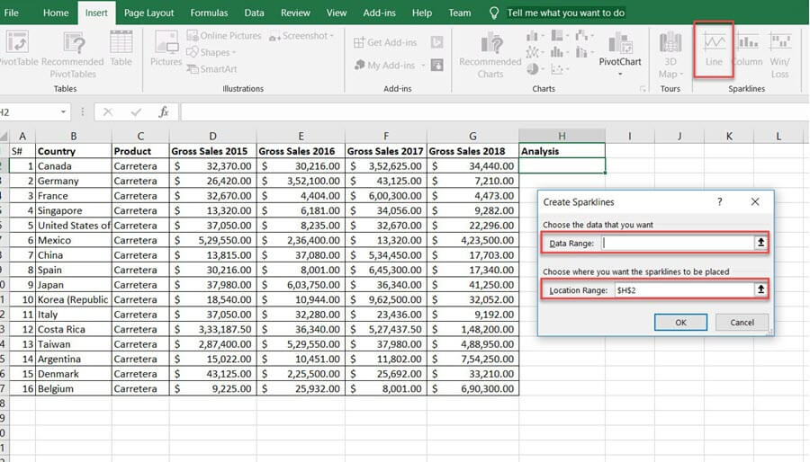
Data Range indicates, which data the Sparkline need to insert. Location range is the cell address where you want to add the Sparkline.
Step 4) Here, the data range is from the cell data contains ‘Gross sales 2015 to 2018’ and location range is from H3. Press the ‘OK’ button after this.

Step 5) The Sparkline will be inserted into the H3 cell. You can apply the Sparkline to entire data by dragging the same to downwards.

Now the Sparkline is created.
How to format a Sparklines in Excel
To format Sparkline, first Click on the created Sparkline. A new tab named design will appear on the menu bar which includes the Sparkline tools and will help you to change its color and style. See the available options one by one.

The different properties of Sparkline can customize according to your need. Style, color, thickness, type, the axis is some among them.
How to change the style of the Sparklines?
Step 1) Select a style from the ‘Style’ option within the design menu. The styles included in a dropdown.

Step 2) Click on the down arrow near to the style option to select your favorite style from an extensive design catalog.

How to change the color of the Sparklines?
The color and thickness of the Sparkline can be changed using the Sparkline Color option. It offers a variety of colors.
Step 1) Select the Sparkline and select the Sparkline Color option from the design menu.

Step 2) Click on the color you want to change. The Sparkline will update with the selected color.

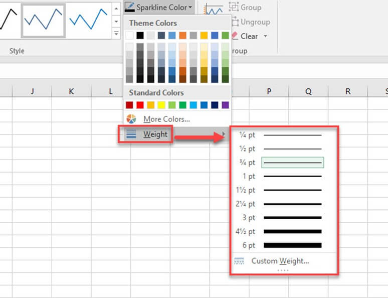
Change the width of lines.
The width of the lines can be adjusted with the option available in the ‘Sparkline Color’ window.
Step 1) Select the Sparkline then go to design menu in the menu bar.
Step 2) Click on the Sparkline Color’ option.
Step 3) Select the Weight option to make changes in thickness to the inserted Sparkline.

Step 4) Move to Weight option. This will give a list of predefined thickness. Customization in Weight is also available.
Highlighting the data points
You can highlight the highest, lowest points, and the entire data points on a Sparkline. By this you to get a better view of the data trend.
Step 1) Select the created Sparkline in any cell then move to the design menu. You can see different checkboxes to highlight the data points.

Step 2) Give checkmark according to the data points you want to highlight. And the options available are:
- High/Low Point: Highlights the high spot the high and low points on the Sparkline.
- First/Last Point: This will help to highlight the first and last data points on the Sparkline.
- Negative Points: Use this to highlight negative values.
- Markers: This option applies only to line Sparkline. It will highlight all data points with a marker. Different color and style are available with more marker colors and lines.

Deleting the Sparklines
You can’t remove the Sparkline by hitting the ‘delete’ key on a keyboard. To delete the Sparkline, you should go to the ‘Clear’ option.
Step 1) Select the cell, which included the Sparkline.
Step 2) Go to Sparkline tools design menu.
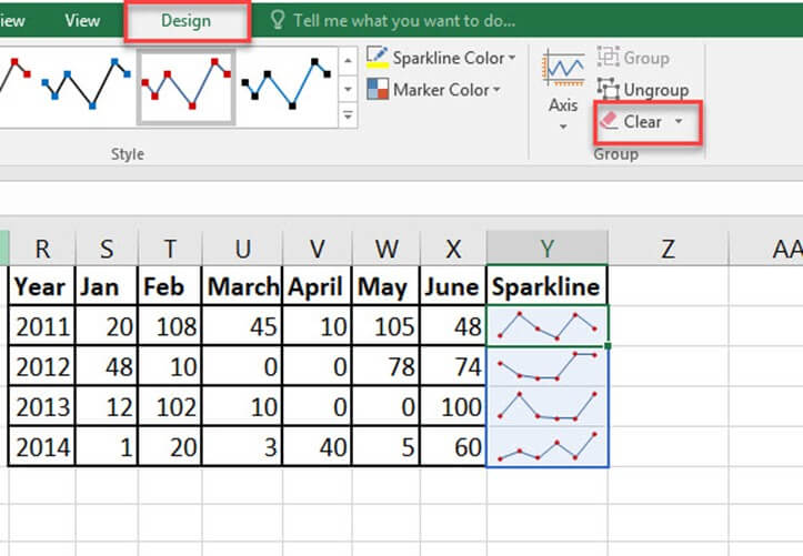
Step 3) Click on the clear option this will delete the selected Sparkline from the cell.
Advantages of Sparklines in Excel
Here are important reasons for using Sparkline:
- Visualization of data like temperature or stock market price.
- Transforming data into a compact form.
- Data reports generating for a short time.
- Analyze data trends for a particular time.
- Easy to understand the fluctuations in the data.
- A better understanding of high and low data points.
- Negative values can float effectively by sparkline.
- Sparkline automatically adjusts its size once the cell width is changed.