
Bar Chart & Histogram in R with Example
 Editorial Team
⚡ Smart Summary
Bar Chart and Histogram in R are built with ggplot2, using geom_bar() for categorical counts and geom_histogram() for continuous distributions. This walkthrough customises colour, grouping, stacking, orientation, binning, and in-bar labels on the mtcars dataset.
What is a Bar Chart in R?
A bar chart is a great way to display categorical variables in the x-axis. This type of graph denotes two aspects in the y-axis.
- The first counts the number of occurrences in each group.
- The second shows a summary statistic (minimum, maximum, average and so on) of a variable on the y-axis.
You will use the mtcars dataset, which has the following variables:
- cyl: Number of the cylinder in the car. Numeric variable
- am: Type of transmission. 0 for automatic and 1 for manual. Numeric variable
- mpg: Miles per gallon. Numeric variable
Because a histogram looks so similar, it is worth settling the difference before writing any code.
Bar Chart vs Histogram in R: Key Differences
The two charts look alike, and they are constantly confused. They answer different questions and use different geometric objects.
| Criteria | Bar Chart | Histogram |
|---|---|---|
| X-axis variable | Categorical or factor | Continuous and numeric |
| What a bar represents | One category | One interval, or bin, of values |
| Gaps between bars | Yes, categories are separate | No, bins are adjacent |
| Bar order | Can be rearranged freely | Fixed by the numeric scale |
| Question answered | How do groups compare? | How is one variable distributed? |
| ggplot2 object | geom_bar() | geom_histogram() |
The rule of thumb: if reordering the bars would still make sense, you have a bar chart. If reordering them would destroy the meaning, you have a histogram. For quartile-based summaries of the same continuous variable, use a box plot.
How to Create a Bar Chart in R
To create graph in R, you can use the library ggplot which creates ready-for-publication graphs. The basic syntax of this library is:
ggplot(data, mapping = aes()) +
geometric object

arguments:
data: dataset used to plot the graph
mapping: Control the x and y-axis
geometric object: The type of plot you want to show. The most common objects are:

- Point: `geom_point()`
- Bar: `geom_bar()`
- Line: `geom_line()`
- Histogram: `geom_histogram()`
This tutorial focuses on the geometric object geom_bar(), which draws the bar chart, and on geom_histogram() for continuous data.
Bar chart: count
Your first graph shows the frequency of cylinder with geom_bar(). The code below is the most basic syntax.
library(ggplot2)
# Most basic bar chart
ggplot(mtcars, aes(x = factor(cyl))) +
    geom_bar()
Code Explanation
- You pass the dataset mtcars to ggplot.
- Inside the aes() argument, you set the x-axis to the factor variable cyl
- The + sign means you want R to keep reading the code. It makes the code more readable by breaking it.
- Use geom_bar() for the geometric object.
Output:

Note: make sure you convert the variables into a factor otherwise R treats the variables as numeric. See the example below.

Customize the graph
Four arguments can be passed to customize the graph:
- `stat`: Controls what is plotted on the y-axis. By default `count`, which tallies rows. To plot a value you already computed, pass `stat = "identity"`
- `alpha`: Control density of the color
- `fill`: Change the color of the bar
- `size`: Control the size the bar
Change the color of the bars
You can change the color of the bars. Note that the colors of the bars are all similar.
# Change the color of the bars
ggplot(mtcars, aes(x = factor(cyl))) +
    geom_bar(fill = "coral") +
    theme_classic()
Code Explanation
- The colors of the bars are controlled by the aes() mapping inside the geometric object (i.e. not in the ggplot()). You can change the color with the fill arguments. Here, you choose the coral color.
Output:

You can use this code:
grDevices::colors()
to see all the colors available in R. There are around 650 colors.
Change the intensity
You can increase or decrease the intensity of the bars’ color
# Change intensity
ggplot(mtcars,
        aes(factor(cyl))) +
    geom_bar(fill = "coral",
        alpha = 0.5) +
    theme_classic()
Code Explanation
- To increase/decrease the intensity of the bar, you can change the value of the alpha. A large alpha increases the intensity, and low alpha reduces the intensity. alpha ranges from 0 to 1. At 1 the colour matches the palette exactly; at 0 the bar is invisible. Here you choose alpha = 0.5.
Output:

Color by groups
You can change the colors of the bars, meaning one different color for each group. For instance, cyl variable has three levels, then you can plot the bar chart with three colors.
# Color by group
ggplot(mtcars, aes(factor(cyl),
        fill = factor(cyl))) +
    geom_bar()
Code Explanation
- The argument fill inside the aes() changes the colour of the bar. You change the color by setting fill = x-axis variable. In your example, the x-axis variable is cyl; fill = factor(cyl)
Output:

Add a group in the bars
You can further split the y-axis based on another factor level. For instance, you can count the number of automatic and manual transmission based on the cylinder type.
You will proceed as follow:
- Step 1: Create the data frame with mtcars dataset
- Step 2: Label the am variable with auto for automatic transmission and man for manual transmission. Convert am and cyl as a factor so that you don’t need to use factor() in the ggplot() function.
- Step 3: Plot the bar chart to count the number of transmission by cylinder
library(dplyr)
# Step 1
data <- mtcars %>%
#Step 2
mutate(am = factor(am, labels = c("auto", "man")),
    cyl = factor(cyl))
With the dataset ready, you can plot the graph:
# Step 3
ggplot(data, aes(x = cyl, fill = am)) +
    geom_bar() +
    theme_classic()
Code Explanation
- The ggplot() call receives the dataset data and the aes() mapping.
- In the aes() you include the variable x-axis and which variable is required to fill the bar (i.e. am)
- geom_bar(): Create the bar chart
Output:
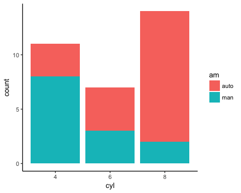
The mapping will fill the bar with two colors, one for each level. It is effortless to change the group by choosing other factor variables in the dataset.
Bar chart in percentage
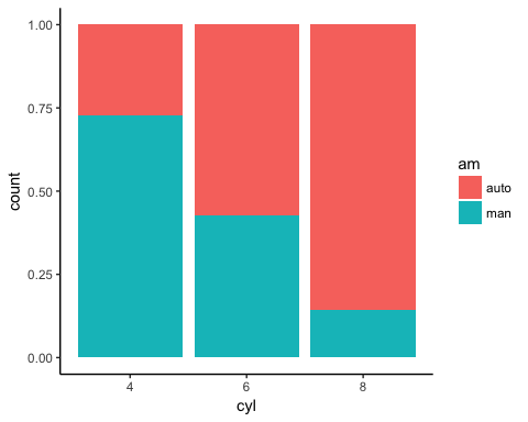
You can visualize the bar in percentage instead of the raw count.
# Bar chart in percentage
ggplot(data, aes(x = cyl, fill = am)) +
    geom_bar(position = "fill") +
    theme_classic()
Code Explanation
- Use position = “fill” in the geom_bar() argument to create a graphic with percentage in the y-axis.
Output:
Side by side bars
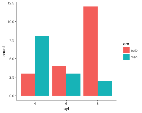
It is easy to plot the bar chart with the group variable side by side.
# Bar chart side by side
ggplot(data, aes(x = cyl, fill = am)) +
    geom_bar(position = position_dodge()) +
    theme_classic()
Code Explanation
- position=position_dodge(): Explicitly tells how to arrange the bars
Output:
Bar Chart with a Summary Statistic
In the second part of the tutorial, the y-axis carries a computed value rather than a count. Note that this is still a bar chart: a true histogram is covered further down, and it uses a different geometric object.
Your objective is to create a graph with the average mile per gallon for each type of cylinder. To draw an informative graph, you will follow these steps:
- Step 1: Create a new variable with the average mile per gallon by cylinder
- Step 2: Create a basic histogram
- Step 3: Change the orientation
- Step 4: Change the color
- Step 5: Change the size
- Step 6: Add labels to the graph
Step 1) Create a new variable
You create a data frame named data_histogram which simply returns the average miles per gallon by the number of cylinders in the car. You call this new variable mean_mpg, and you round the mean with two decimals.
# Step 1
data_histogram <- mtcars %>%
mutate(cyl = factor(cyl)) %>%
group_by(cyl) %>%
summarize(mean_mpg = round(mean(mpg), 2))
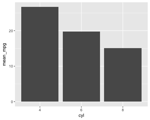
Step 2) Create a basic histogram
You can plot the histogram. It is not yet polished enough to hand to a client, but it already shows the trend.
ggplot(data_histogram, aes(x = cyl, y = mean_mpg)) +
    geom_bar(stat = "identity")
Code Explanation
- The aes() has now two variables. The cyl variable refers to the x-axis, and the mean_mpg is the y-axis.
- You pass stat = “identity” so that geom_bar() uses the y-axis variable as it is instead of counting rows. The default for geom_bar() is stat = “count”.
Output:
Step 3) Change the orientation
You change the orientation of the graph from vertical to horizontal.
ggplot(data_histogram, aes(x = cyl, y = mean_mpg)) +
    geom_bar(stat = "identity") +
    coord_flip()
Code Explanation
- You can control the orientation of the graph with coord_flip().
Output:

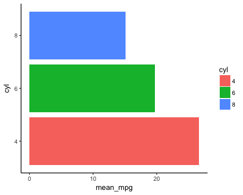
Step 4) Change the color
You can differentiate the colors of the bars according to the factor level of the x-axis variable.
ggplot(data_histogram, aes(x = cyl, y = mean_mpg, fill = cyl)) +
    geom_bar(stat = "identity") +
    coord_flip() +
    theme_classic()
Code Explanation
- You can plot the graph by groups with the fill= cyl mapping. R takes care automatically of the colors based on the levels of cyl variable
Output:
Step 5) Change the size
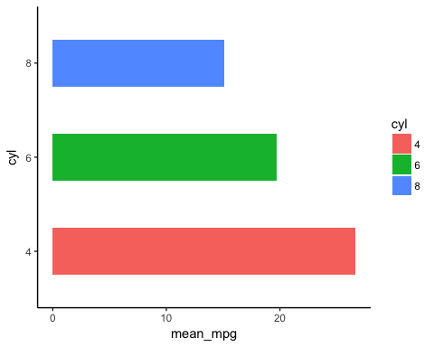
To make the graph looks prettier, you reduce the width of the bar.
graph <- ggplot(data_histogram, aes(x = cyl, y = mean_mpg, fill = cyl)) +
    geom_bar(stat = "identity",
        width = 0.5) +
    coord_flip() +
    theme_classic()
Code Explanation
- The width argument inside geom_bar() controls the thickness of the bar. A larger value makes it wider.
- The plot is stored in the object graph, because the next step reuses it unchanged. Storing intermediate plots keeps the code readable.
Output:
Step 6) Add labels to the graph
The last step adds the value of mean_mpg as a label inside each bar.
graph +
    geom_text(aes(label = mean_mpg),
        hjust = 1.5,
        color = "white",
        size = 3) +
    theme_classic()
Code Explanation
- The function geom_text() is useful to control the aesthetic of the text.
- label=: Add a label inside the bars
- mean_mpg: Use the variable mean_mpg for the label
- hjust controls where the label sits along the bar. Values close to 1 place it near the end of the bar, and larger values push it back towards the axis. If the orientation of the graph is vertical, change hjust to vjust.
- color=”white”: Change the color of the text. Here you use the white color.
- size=3: Set the size of the text.
Output:

How to Order and Label Bars in a Bar Chart in R
Two finishing touches separate a draft chart from a publishable one: sorting the bars by value and labelling the axes properly.
Reordering bars. ggplot2 arranges factor levels alphabetically by default, which is rarely the most informative order. Wrap the x variable in reorder() to sort by a second variable:
# Sort the bars from lowest to highest mean_mpg
ggplot(data_histogram, aes(x = reorder(cyl, mean_mpg), y = mean_mpg)) +
    geom_bar(stat = "identity", fill = "coral") +
    theme_classic()
Prefix the sorting variable with a minus sign, reorder(cyl, -mean_mpg), to reverse the direction.
Adding titles and axis labels. The labs() function sets every text element in one call:
ggplot(data_histogram, aes(x = cyl, y = mean_mpg, fill = cyl)) +
    geom_bar(stat = "identity") +
    labs(title = "Average fuel economy by cylinder count",
        subtitle = "mtcars dataset",
        x = "Number of cylinders",
        y = "Mean miles per gallon",
        fill = "Cylinders",
        caption = "Source: mtcars") +
    theme_classic()
Set fill = NULL inside labs() to drop the legend title entirely, and use theme(legend.position = “none”) to remove the legend when the x-axis already names the groups.
Choosing your own colours. Replace the default palette with an explicit one so the chart matches your house style:
scale_fill_manual(values = c("4" = "#0e9cd1", "6" = "coral", "8" = "grey40"))
How to Create a Histogram in R with geom_histogram()
A histogram shows how a single continuous variable is distributed. Instead of counting categories, ggplot2 slices the numeric range into bins and counts how many observations fall into each one.
library(ggplot2)
# Most basic histogram
ggplot(mtcars, aes(x = mpg)) +
    geom_histogram()
R prints a message recommending that you pick a better bin count, because the default of 30 bins is arbitrary. Two arguments control this:
- bins: the number of intervals to split the range into.
- binwidth: the width of each interval, expressed in the units of the variable. Use this one when the units are meaningful.
# Set the number of bins
ggplot(mtcars, aes(x = mpg)) +
    geom_histogram(bins = 10, fill = "coral", color = "white") +
    theme_classic()

# Or set the width of each bin instead
ggplot(mtcars, aes(x = mpg)) +
    geom_histogram(binwidth = 4, fill = "coral", color = "white") +
    theme_classic()
Binning is the single most important choice in a histogram. Too few bins hide real structure such as a second peak; too many turn the chart into noise. Try several values before settling on one.
Comparing groups. Map a factor to fill and set the position so the distributions stay readable:
ggplot(mtcars, aes(x = mpg, fill = factor(cyl))) +
    geom_histogram(bins = 10, position = "identity", alpha = 0.5) +
    theme_classic()
With position = “identity” and a reduced alpha the histograms overlap so you can compare shapes directly. Use position = “dodge” if you would rather see the bins side by side.
Density instead of counts. When the groups differ in size, plot density so the areas are comparable, and overlay a smoothed curve:
ggplot(mtcars, aes(x = mpg)) +
    geom_histogram(aes(y = after_stat(density)), bins = 10,
        fill = "coral", alpha = 0.6) +
    geom_density(color = "steelblue", linewidth = 1) +
    theme_classic()
Bar Chart and Histogram in R: Code Reference
A bar chart suits a categorical x-axis, where the y-axis is either a count or a summary statistic. The table below lists the ggplot2 call for each variant covered above:
| Objective | Code |
|---|---|
| Count |
ggplot(df, aes(x = factor(x1))) + geom_bar() |
| Count with different color of fill |
ggplot(df, aes(x = factor(x1), fill = factor(x1))) + geom_bar() |
| Count with groups, stacked |
ggplot(df, aes(x = factor(x1), fill = factor(x2))) + geom_bar() |
| Count with groups, side by side |
ggplot(df, aes(x = factor(x1), fill = factor(x2))) + geom_bar(position = position_dodge()) |
| Count with groups, stacked in % |
ggplot(df, aes(x = factor(x1), fill = factor(x2))) + geom_bar(position = "fill") |
| Values (summary statistic) |
ggplot(df, aes(x = factor(x1), y = x2)) + geom_bar(stat = "identity") |
| Histogram of a continuous variable |
ggplot(df, aes(x = x1)) + geom_histogram(bins = 30) |
