
Scatter Plot in R Using ggplot2 with Example
 Editorial Team
⚡ Smart Summary
Scatter Plot in R using ggplot2 maps two continuous variables to the x and y axes with geom_point(). This walkthrough covers grouping by colour, log transformations, fitted regression lines, labels, faceting, overplotting fixes, scales, themes, and saving.
Why Graphs Matter in Data Analysis
Graphs are the third part of the process of data analysis. The first part is about data extraction, the second part deals with cleaning and manipulating the data. At last, the data scientist may need to communicate his results graphically.
The workflow of a data scientist is summarised in the picture below.
- The first task of a data scientist is to define a research question. This research question depends on the objectives and goals of the project.
- After that, one of the most prominent tasks is the feature engineering. The data scientist needs to collect, manipulate and clean the data
- When this step is completed, he can start to explore the dataset. Sometimes, it is necessary to refine and change the original hypothesis due to a new discovery.

- When the explanatory analysis is achieved, the data scientist has to consider the capacity of the reader to understand the underlying concepts and models.
- His results should be presented in a format that all stakeholders can understand. One of the best methods to communicate the results is through a graph.
- Graphs are an incredible tool to simplify complex analysis.
The rest of this tutorial builds those graphs with the ggplot2 package.
The ggplot2 Package
This tutorial focuses on building charts in R with ggplot2.
In this tutorial, you are going to use ggplot2 package. The package implements the Grammar of Graphics described by Leland Wilkinson in 2005. ggplot2 is flexible, ships with many themes, and lets you specify a plot at a high level of abstraction. Note that it does not produce three-dimensional or interactive graphics; those require packages such as plotly or rgl.
In ggplot2, a graph is composed of the following arguments:
- data
- aesthetic mapping
- geometric object
- statistical transformations
- scales
- coordinate system
- position adjustments
- faceting
You will learn how to control those arguments in the tutorial.
The basic syntax of ggplot2 is:
ggplot(data, mapping=aes()) +
geometric object

arguments:
data: Dataset used to plot the graph
mapping: Control the x and y-axis
geometric object: The type of plot you want to show. The most common object are:

- Point: `geom_point()`
- Bar: `geom_bar()`
- Line: `geom_line()`
- Histogram: `geom_histogram()`
How to Create a Scatter Plot in R
Let’s see how ggplot works with the mtcars dataset. You start by plotting a scatterplot of the mpg variable and drat variable.
Basic scatter plot
library(ggplot2)
ggplot(mtcars, aes(x = drat, y = mpg)) +
    geom_point()
Code Explanation
- You first pass the dataset mtcars to ggplot.
- Inside the aes() argument, you add the x-axis and y-axis.
- The + sign means you want R to keep reading the code. It makes the code more readable by breaking it.
- Use geom_point() for the geometric object.
Output:

Scatter plot with groups
Sometimes, it can be interesting to distinguish the values by a group of data (i.e. factor level data).
ggplot(mtcars, aes(x = mpg, y = drat)) +
    geom_point(aes(color = factor(gear)))
Code Explanation
- The aes() inside geom_point() controls the colour of each group. The grouping variable must be a factor, so gear is wrapped in factor().
- Altogether, you have the code aes(color = factor(gear)) that change the color of the dots.
Output:

Change the Axis Scale with a Log Transformation
Rescaling data is a large part of the analyst job, because raw variables rarely arrive in a neat bell shape. Taking logarithms is one way to compress extreme values and make the plot less sensitive to outliers.
ggplot(mtcars, aes(x = log(mpg), y = log(drat))) +
    geom_point(aes(color = factor(gear)))
Code Explanation
- You transform the x and y variables in log() directly inside the aes() mapping.
Note that any other transformation can be applied such as standardization or normalization.
Output:

Scatter plot with fitted values
You can add another level of information to the graph. You can overlay the fitted values of a linear regression.
my_graph <- ggplot(mtcars, aes(x = log(mpg), y = log(drat))) +
    geom_point(aes(color = factor(gear))) +
    stat_smooth(method = "lm",
        col = "#C42126",
        se = FALSE,
        size = 1)
my_graph
Code Explanation
- my_graph: the plot is stored in the object my_graph, so later steps can add layers without repeating the whole call
- The argument stat_smooth() controls for the smoothing method
- method = “lm”: Linear regression
- col = “#C42126”: Code for the red color of the line
- se = FALSE: Don’t display the standard error
- size = 1: the thickness of the line. In ggplot2 3.4.0 and later this argument was renamed linewidth for line geometries.
Output:

Note that other smoothing methods are available
- glm
- gam
- loess: the default for fewer than 1,000 observations
- rlm: robust linear model, from the MASS package
Before styling the chart, it is worth knowing when a scatter plot is the right choice at all.
Scatter Plot vs Line Chart vs Bubble Chart in R
All three plot two continuous variables against each other, so the choice comes down to what the reader should take away.
| Criteria | Scatter Plot | Line Chart | Bubble Chart |
|---|---|---|---|
| Shows | Correlation between two variables | Change of one variable over an ordered axis | Correlation plus a third magnitude |
| X-axis | Any continuous variable | Usually time or another ordered scale | Any continuous variable |
| Point order | Irrelevant | Critical, points are connected | Irrelevant |
| Third variable | Through colour or shape | Through separate lines | Through point size |
| ggplot2 call | geom_point() | geom_line() | geom_point(aes(size = z)) |
Connecting scatter points with a line when the x-axis has no natural order is a common mistake: it implies a sequence that does not exist. Reserve geom_line() for ordered axes such as dates. For distributions of a single variable, use a box plot instead.
Add information to the graph
So far the graphs carry no explanatory text. A reader should be able to see the story in the data from the chart alone, without consulting extra documentation, which means the chart needs good labels. You can add labels with the labs() function.
The basic syntax for labs() is:
labs(title = "Hello Guru99")
arguments:
- title: Main title displayed above the plot
- subtitle: Secondary line below the title
- caption: Note below the plot, usually the data source
- x: Rename the x-axis
- y: Rename the y-axis
- color / fill: Rename the legend

Example: labs(title = "Hello Guru99", subtitle = "My first plot")
Add a title
One mandatory information to add is obviously a title.
my_graph +
    labs(
        title = "Plot Mile per hours and drat, in log"
         )
Code Explanation
- my_graph: You use the graph you stored. It avoids rewriting all the codes each time you add new information to the graph.
- You wrap the title inside labs().
Output:

Add a title with a dynamic name
A dynamic title is helpful to add more precise information in the title.
You can use the paste() function to print static text and dynamic text. The basic syntax of paste() is:
paste("This is a text", A)
arguments
- " ": Text inside the quotation marks are the static text
- A: Display the variable stored in A
- Note you can add as much static text and variable as you want. You need to separate them with a comma
Example:
A <- 2010
paste("The first year is", A)
Output:
## [1] "The first year is 2010"
B <- 2018
paste("The first year is", A, "and the last year is", B)
Output:
## [1] "The first year is 2010 and the last year is 2018"
You can add a dynamic name to our graph, namely the average of mpg.
mean_mpg <- mean(mtcars$mpg)
my_graph + labs(
    title = paste("Plot Mile per hours and drat, in log. Average mpg is", mean_mpg)
)
Code Explanation
- You create the average of mpg with mean(mtcars$mpg) stored in mean_mpg variable
- You use the paste() with mean_mpg to create a dynamic title returning the mean value of mpg
Output:

Add a subtitle
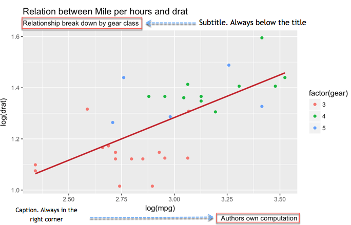
Two further details make the graph more explicit. You are talking about the subtitle and the caption. The subtitle goes right below the title. The caption can inform about who did the computation and the source of the data.
my_graph +
    labs(
        title =
        "Relation between Mile per hours and drat",
        subtitle =
        "Relationship break down by gear class",
        caption = "Authors own computation"
    )
Code Explanation
- Inside labs(), you added:
- title = “Relation between Mile per hours and drat”: Add title
- subtitle = “Relationship break down by gear class”: Add subtitle
- caption = “Authors own computation: Add caption
- You separate each new information with a comma, ,
- Note that you break the lines of code. It is not compulsory, and it only helps to read the code more easily
Output:
Rename x-axis and y-axis
Column names are rarely presentation-ready. They are often abbreviated or use underscores between words, as in GDP_CAP. Rename them on the plot and add units where they matter.
my_graph +
    labs(
        x = "Drat definition",
        y = "Mile per hours",
        color = "Gear",
        title = "Relation between Mile per hours and drat",
        subtitle = "Relationship break down by gear class",
        caption = "Authors own computation"
    )
Code Explanation
- Inside labs(), you added:
- x = “Drat definition”: Change the name of x-axis
- y = “Mile per hours”: Change the name of y-axis
Output:

Control the scales
You can control the scale of the axis.
The function seq() is convenient when you need to create a sequence of number. The basic syntax is:
seq(begin, last, by = x)
arguments:
- begin: First number of the sequence
- last: Last number of the sequence
- by= x: The step. For instance, if x is 2, the code adds 2 to `begin-1` until it reaches `last`
For instance, a range from 0 to 12 with a step of 4 returns four numbers: 0, 4, 8 and 12.
seq(0, 12,4)
Output:
## [1] 0 4 8 12
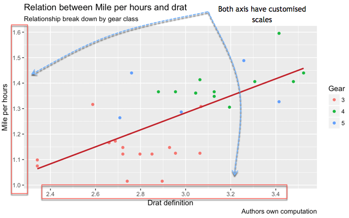
You can control the scale of the x-axis and y-axis as below
my_graph +
    scale_x_continuous(breaks = seq(1, 3.6, by = 0.2)) +
    scale_y_continuous(breaks = seq(1, 1.6, by = 0.1)) +
    labs(
        x = "Drat definition",
        y = "Mile per hours",
        color = "Gear",
        title = "Relation between Mile per hours and drat",
        subtitle = "Relationship break down by gear class",
        caption = "Authors own computation"
    )
Code Explanation
- The function scale_y_continuous() controls the y-axis
- The function scale_x_continuous() controls the x-axis.
- The parameter breaks controls the split of the axis. You can manually add the sequence of number or use the seq()function:
- seq(1, 3.6, by = 0.2): Create the sequence from 1 to 3.6 in steps of 0.2, that is 14 break points
- seq(1, 1.6, by = 0.1): Create seven numbers from 1 to 1.6 in steps of 0.1
Output:
Theme
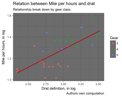
Finally, ggplot2 lets you restyle the whole plot with a single theme function. Eight complete themes ship with the package:
- theme_bw()
- theme_light()
- theme_classic()
- theme_linedraw()
- theme_dark()
- theme_minimal()
- theme_gray()
- theme_void()
my_graph +
    theme_dark() +
    labs(
        x = "Drat definition, in log",
        y = "Mile per hours, in log",
        color = "Gear",
        title = "Relation between Mile per hours and drat",
        subtitle = "Relationship break down by gear class",
        caption = "Authors own computation"
    )
Output:

Save Plots
After all these steps, it is time to save and share your graph. Call ggsave(“name_of_the_file.png”) straight after plotting and the image is written to disk.
The graph is saved in the working directory. To check the working directory, you can run this code:
directory <- getwd()
directory
Plot the finished graph, save it, and check where it landed:
my_graph +
    theme_dark() +
    labs(
        x = "Drat definition, in log",
        y = "Mile per hours, in log",
        color = "Gear",
        title = "Relation between Mile per hours and drat",
        subtitle = "Relationship break down by gear class",
        caption = "Authors own computation"
    )
Output:
ggsave("my_fantastic_plot.png")
Output:
## Saving 5 x 4 in image
Note: For pedagogical purpose only, we created a function called open_folder() to open the directory folder for you. You just need to run the code below and see where the picture is stored. You should see a file names my_fantastic_plot.png.
# Run this code to create the function
open_folder <- function(dir) {
    if (.Platform['OS.type'] == "windows") {
        shell.exec(dir)
    } else {
        system(paste(Sys.getenv("R_BROWSER"), dir))
    }
}

# Call the function to open the folder
open_folder(directory)
How to Create Faceted Scatter Plots in R with facet_wrap()
Faceting is one of the eight ggplot2 components listed earlier, and it is the cleanest answer to a crowded chart. Instead of squeezing every group into one panel, ggplot2 draws a small multiple for each level of a variable, all on the same scales so the panels stay comparable.
# One panel per gear count
ggplot(mtcars, aes(x = drat, y = mpg)) +
    geom_point() +
    facet_wrap(~ gear) +
    theme_classic()
Three arguments do most of the work.
- ncol or nrow: force the panels into a given layout, for example facet_wrap(~ gear, ncol = 2).
- scales: “fixed” by default so every panel shares one axis range. Use “free_y” or “free” when the groups differ wildly in magnitude, but be aware that free scales make visual comparison between panels misleading.
- labeller: replaces the raw factor level in each strip, for example labeller = label_both to print “gear: 4” instead of “4”.
Two grouping variables. Use facet_grid() to build a matrix of panels, with the first variable across rows and the second across columns:
ggplot(mtcars, aes(x = drat, y = mpg)) +
    geom_point(aes(color = factor(cyl))) +
    facet_grid(am ~ gear) +
    theme_classic()
Facets or colours? Colour works well up to about four groups on a chart with limited overlap. Beyond that, or whenever the groups overlap heavily, faceting is easier to read because each panel carries only its own points. You can combine both: facet by one variable and colour by another, as in the facet_grid() example above.
How to Handle Overplotting in R Scatter Plots
With a few dozen observations every point is visible. With thousands, markers stack on top of one another and the densest region simply reads as a solid blob. That is overplotting, and ggplot2 offers four standard remedies.
1. Reduce opacity. The cheapest fix. Overlapping points darken naturally, so density becomes visible:
ggplot(diamonds, aes(x = carat, y = price)) +
    geom_point(alpha = 0.05) +
    theme_classic()
2. Jitter discrete values. When a variable takes only a handful of values, points land on the same coordinates. A small random displacement separates them:
ggplot(mtcars, aes(x = factor(cyl), y = mpg)) +
    geom_jitter(width = 0.15, height = 0) +
    theme_classic()
Set height = 0 so the y values, which carry the real information, are never altered.
3. Bin the plane. For large datasets, count observations per cell and map the count to colour. Hexagonal bins avoid the visual artefacts that square bins produce:
ggplot(diamonds, aes(x = carat, y = price)) +
    geom_hex(bins = 40) +
    theme_classic()
4. Draw density contours. Contour lines outline the regions where the observations concentrate, and they layer neatly over faded points:
ggplot(diamonds, aes(x = carat, y = price)) +
    geom_point(alpha = 0.05) +
    geom_density_2d(color = "#C42126") +
    theme_classic()
As a rule of thumb, alpha handles a few thousand points, hexagonal binning handles tens of thousands, and sampling the data with dplyr::slice_sample() is the pragmatic option beyond that.
Scatter Plot in R: Code Reference
The table below lists the ggplot2 call for each option covered above:
| Objective | Code |
|---|---|
| Basic scatter plot |
ggplot(df, aes(x = x1, y = y)) + geom_point() |
| Scatter plot with colour group |
ggplot(df, aes(x = x1, y = y)) + geom_point(aes(color = factor(x2))) |
| Add fitted values |
ggplot(df, aes(x = x1, y = y)) + geom_point() + stat_smooth(method = "lm") |
| Add title |
ggplot(df, aes(x = x1, y = y)) + geom_point() + labs(title = paste("Hello Guru99")) |
| Add subtitle |
ggplot(df, aes(x = x1, y = y)) + geom_point() + labs(subtitle = paste("Hello Guru99")) |
| Rename x |
ggplot(df, aes(x = x1, y = y)) + geom_point() + labs(x = "X1") |
| Rename y |
ggplot(df, aes(x = x1, y = y)) + geom_point() + labs(y = "y1") |
| Control the scale |
ggplot(df, aes(x = x1, y = y)) + geom_point() + scale_y_continuous(breaks = seq(10, 35, by = 10)) + scale_x_continuous(breaks = seq(2, 5, by = 1)) |
| Create logs |
ggplot(df, aes(x = log(x1), y = log(y))) + geom_point() |
| Theme |
ggplot(df, aes(x = x1, y = y)) + geom_point() + theme_classic() |
| Facet by a group |
ggplot(df, aes(x = x1, y = y)) + geom_point() + facet_wrap(~ x2) |
| Handle overplotting |
ggplot(df, aes(x = x1, y = y)) + geom_point(alpha = 0.3) |
| Save |
ggsave("my_fantastic_plot.png")
|
