
LoadRunner Analysis Tutorial: Report & Graph
 Editorial Team
⚡ Smart Summary
LoadRunner Analysis turns the raw results dump left by Controller into readable graphs, a summary report and an exportable HTML report, so a finished load test becomes evidence you can hand to stakeholders.
How to Use Analysis in LoadRunner
LoadRunner Analysis, as the name suggests, is a program to perform detailed (literally, very detailed) analysis on the performance test you’ve carried out.
Analysis takes the dump created by Controller during execution of your load test. The dump contains all the information in a raw format, which is parsed by Analysis to generate various graphs.
Brand note: these screens are from the HP-era release. The product passed to Micro Focus and is now OpenText Professional Performance Engineering; the Analysis menus and graph names are unchanged.
Let’s learn more about LoadRunner Analysis.
To launch Analysis, go to Start Menu =>HP Software =>HP LoadRunner =>Analysis as demonstrated below:

This will launch Analysis. As usual, at first a splash screen will open as shown below:

After a moment, this splash screen will automatically lead to the main screen of Analysis. The main screen will open in restored mode. Refer to below snapshot:

Click on the File menu and you will see a list of menus as in below snapshot:

Click on the File menu or use Ctrl + N to create a new analysis session. This will open a dialogue box to help you locate the lrr file. The file extension, LRR, stands for LoadRunner Results.
Remember that the Controller creates a repository of results in a folder? That folder contains the lrr file.
Version note: .lrr holds the raw Controller output; the parsed session is saved separately as .lra, and that is what you reopen. Results > Auto Load Analysis makes the Controller start Analysis for you.
Locate the res folder of the scenario for which you wish to create the analysis session. A snapshot has been provided below for reference:

As soon as you select the correct file, Analysis will first check for available disk space to ensure you don’t run out of space during the process. This is because the size of a session can be very large, especially for complex scenarios where you’ve included multiple VUser scripts and run for long hours. The confirmation appears momentarily, beside the File menu entry below.

Immediately after affirming availability of disk space, Analysis will come to action and you will see a “currently analyzing” window, as shown below:

The time taken by the above window depends upon the size of the result folder (or the statistics contained in that folder).
If it takes way too long, or gets stuck, you can opt to cancel by clicking on the cancel button.
Once finished, this will automatically lead to a quick window where the format template will be applied:

This should quickly lead you to the main window of Session Explorer. However, if you’re using some complex custom template and the operation halts for any reason, you can click on the Stop button to cancel the operation and start over.
LoadRunner Analysis Summary Report
Once the operation completes, you will see the main session window, which looks something like this:

Here you can see the directory where you picked up the results from.
You can also see complete information about your scenario within the Analysis session. In the Summary Report tab, you can see the duration of the scenario which was run to get these results.
The term percentile is used in analysis almost with every graph. You can define the value for percentile in the properties panel. The default is set to 90.

Notice the graph section in Session Explorer:

A few graphs appear already. You can click on the graph name and you will see its detailed appearance.
From the Summary Report, you can open the SLA-related information for the run, if an SLA was defined in the Controller.
Upon clicking, you will see the below window:

You can locate the toolbar just below the File menu on the top; it looks like this:

All the buttons in the toolbar perform some action from within the File menu.
Analysis contains every bit of information about your scenario, including run-time settings. As you’re aware by now, run-time settings have a significant impact on performance, so you can view the settings that were used to run the scenario from within Analysis itself.
To view the Run Time Settings, click on from the File menu or the  button from the toolbar.
The Run Time Settings will be displayed as below:

As you can see, not only can all the settings be seen from within this window, you can also open the Schedule by clicking on the  button, or view the script by clicking on the
  button. To close the window, click on the
  button.
Analysis Graphs
Analysis loads the most important graphs at the time of analysis. You can click on any graph name in the Session Explorer to view the details of that graph.
Two controls change what every graph shows: granularity, the time slice each data point covers, and filters, which restrict the graph to chosen transactions or VUsers.
Let’s discuss a few graphs one by one.
Average Response Time Graph
This graph displays the average time taken to perform each transaction during every second of the load test. It shows whether server performance stays inside the agreed minimum and maximum response-time range.
Have a look at the graph of our scenario:

When viewing a graph, it is pivotal to understand the graph legend side by side.
The Legend shows the transaction name, its color, minimum value, average value, maximum value and standard deviation (variance around the mean).
The colors of the graph can be recognized from the Legend.
Hits Per Second Graph
This graph displays the number of hits made on the Web server by VUsers during each second of the load test. This graph helps you evaluate the amount of load VUsers generate, in terms of the number of hits.
Have a look at the graph in the case of our scenario:

As can be seen from the graph as well as the legend, there were times when there were no hits to the server.
Running VUsers Graph
This graph displays the number of VUsers that executed VUser scripts, and their status, during each second of a load test. This graph is useful for determining the VUser load on your server at any given moment.

Throughput Graph
This graph displays the amount of throughput (in bytes) on the Web server during the load test. Throughput represents the amount of data that the VUsers received from the server at any given second. This graph helps you to evaluate the amount of load VUsers generate, in terms of server throughput.

Here is a description of some more graphs:
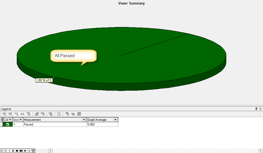
VUser Summary Graph
This graph displays the number of VUsers that completed their run successfully, stopped their run, or ended with errors. This is how it looks:
Rendezvous Graph
This graph indicates when VUsers were released at rendezvous points and how many VUsers were released at each point. This is how it looks:

Transactions Per Second Graph
This graph displays the number of completed transactions (both successful and unsuccessful) performed during each second of a load test. This graph helps you determine the actual transaction load on your system at any given moment. This is how it looks:

Total Transactions Per Second Graph
This graph displays the total number of completed transactions (both successful and unsuccessful) performed during each second of a load test. This graph helps you determine the actual transaction load on your system at any given moment. This is how it looks:

Transaction Summary Graph
This graph displays the number of transactions that passed, failed, stopped, or ended with errors. This is how it looks:

Transaction Performance Summary Graph
This graph displays the minimum, average, and maximum response time for all the transactions in the load test. This is how it looks:

Transaction Response Time Under Load Graph
This graph displays average transaction response times relative to the number of VUsers running at any given point during the load test. It helps you view the general impact of VUser load on performance time and is most useful when analyzing a load test which is run with a gradual load. This is how it looks:

Transaction Response Time Percentile Graph
This graph displays the percentage of transactions that were performed within a given time range. This graph helps you determine the percentage of transactions that meet the performance criteria defined for your system. This is how it looks:

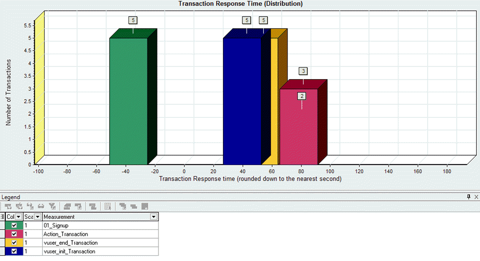
Transaction Response Time Distribution Graph
This graph displays the number of times a transaction was completed over a distribution of time ranges. Note that this graph only displays information for a single transaction at a time. This is how it looks:
Throughput (MB) Graph
This graph displays the amount of throughput (in megabytes) on the Web server during the load test. Throughput represents the amount of data that the VUsers received from the server at any given second. This graph helps you to evaluate the amount of load VUsers generate, in terms of server throughput. This is how it looks:
.png)
HTTP Status Code Summary Graph
This graph displays the distribution of the various HTTP protocol status codes returned from the Web server during the load test. This is how it looks:

HTTP Response Per Second Graph
This graph displays the number of the different HTTP status codes returned from the Web server during each second of the load test. This is how it looks:

Pages Download Per Second Graph
This graph displays the number of pages received from the Web server during the load test. This is how it looks:

Connections Graph
This graph displays the number of connections open against the Web server during the run. This is how it looks:

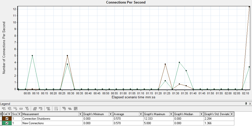
Connections Per Second Graph
This graph displays the number of connections opened per second during the run. This is how it looks:
Page Component Breakdown (Over Time) Graph
This graph displays the average response time (in seconds) for each Web page and its components during each second of the scenario run. This is how it looks:

Page Download Time Breakdown (Over Time) Graph
This graph displays a breakdown of each page component’s download time during each second of the scenario run. This is how it looks:
.png)
Time to First Buffer Graph
This graph displays each Web page component’s relative server/network time (in seconds) during each second of the scenario run, for the period of time until the first buffer is successfully received back from the Web server. This is how it looks:

Merging Graphs
Two graphs may need to be merged to bring out more meaningful information. For example, as we saw in the graphs above, when there were no hits to the server there was also no bandwidth over the network.
That relationship is far easier to see once the two graphs are drawn together.
Let’s see how graphs are merged.
Before you open the graph merging option, ensure you have at least one graph already open, the one you wish to merge. The utility will assume you want to add another graph to the already opened graph.
To open the merge graph window, go to the View menu and click on Merge Graphs. Here is how the menu looks:

Clicking the above menu will open the main window for merging graphs. Here is a snapshot:

Here, we’re merging the Transaction Response Time graph with the Running VUsers graph. The Merge Graph window asks for the merged graph name and one of three merge types:
| Merge type | What it does | Use it when |
|---|---|---|
| Overlay | One plot, a Y-axis on each side, shared X-axis. | Both measurements read on the same timeline. |
| Tile | Graphs stacked, Y-axis split, X-axis shared. | Value ranges are too different to overlay. |
| Correlate | One graph’s Y-axis plotted against the other’s. | Testing whether one measurement drives the other. |
Here is how this merged graph looks:

Add New Graphs
To add a new graph, click on the Graph menu and select Add New Graph.
Refer to the below snapshot of the menu:

Once clicked, it will open a list of all the graphs available in LoadRunner Analysis.
You can select any graph by double-clicking on its name. This will load the graph, with its values and statistics, into the main window of Analysis.
Click the Close button to go back to the main window.
Let’s have a look at the window:

Crossing with Results
If you’ve multiple scenario runs already, you can use their results folders to cross match the statistics. This process helps you directly compare both results and generate a cumulative report.
In order to perform Cross Results, click on the  icon from the toolbar, or click Cross with Results from the File menu.
This will open the window below:

The Result List is showing your current results folder, the one for which the analysis is being performed.
You can click on the Add button to add another result folder against which the cross will be analyzed.

Select the other result folder and click on Open.
The previous Results List window will open again. This time you will have two result folders in the list.
Have a look at the window:

Click on the OK button.
A new window will open containing a side-by-side comparison of both results.
Here is a snapshot:

You can add as many result folders to the cross list as you wish; however, this will become complicated to understand and analyze. So it is suggested to keep the list short.
Saving a Session
Working with Analysis may take significant time. Since you may have merged a graph, or may still be studying a new one, it is a good idea to keep your session information saved.
To save your session, click on the File menu and click on Save.
The dialogue window below will open:

Clicking the Save button will initiate the Save process, which could be instant or time consuming, depending on the size of the session. What gets written is the .lra session file, including any graphs you merged or added.
Here is what the window looks like:

Opening a Session
You can open an existing session in a similar way. Simply click Open under the File menu and select the folder of the saved session. Remember, Analysis will not open the last folder node; rather it will open the folder itself.

This will open the main window of Analysis where you can resume your work.
Exporting into an HTML Report
Analysis provides a feature to export all data into a well-formatted HTML or Word report. To export, click on the Report menu and select HTML Report. Have a look at the menu below:

This will open a dialogue box to locate the directory where the HTML report will be placed.
Have a look at the screen snapshot below:

As soon as you click the Save button, Analysis will start exporting results and preparing a report in HTML format. A splash screen will appear for a short period, depending upon the size of the report you’re exporting:

After the export finishes, it will immediately open the recently exported HTML file in Internet Explorer or your default browser. Here is how your first performance Testing report looks:

Tip: save the template with “Automatically apply this template to a new session” and the automatic HTML report option ticked, and Analysis produces the same report on every future session.
Video on Analyzer
The walkthrough below covers the same Analysis screens in motion.
Click here if the video is not accessible.
Analysis closes the LoadRunner workflow: VuGen scripts are cleaned through correlation and parameterization, run by the Controller, then read here. See the LoadRunner architecture, Performance Testing and Load Testing guides.
